Ikarus DeltaCase study
Ten rounds of revisions, gone
Every 3D product configurator was hand-built from scratch and took ten to fifteen rounds of back-and-forth to finish. We replaced that with one platform, and a three-week build became a seven-day one.
Overview
Ikarus makes 3D products that shoppers can change right on a shop’s product page: a sofa you can re-cover in another fabric, a lamp you can switch to brass. Each one of these is called a configurator. Ikarus Delta is the platform we designed to make them.
Through 2024 Ikarus won clients faster than its way of working could keep up. Every configurator was built from nothing (new models, new code, new screens), and every one took ten to fifteen rounds of fixes before it went live.
With Dipanshu Saini, the other designer on the team, I worked through the discovery, the platform’s structure, its interface and its component system. I was on the project for its first five weeks, until 4 July 2024, when I left Ikarus to start a master’s.
The result was a single platform that three very different groups could work in: the 3D artists making the models, the managers tracking the projects, and the developers putting them on clients’ websites. Building a configurator got 70% faster.
The short version
Each configurator was built from scratch and went through ten to fifteen rounds of fixes, mostly because artists checked their work in one program and it then looked different on the real website.
A month watching each team at work. Then one platform, with no coding needed, where the model is checked looking exactly the way shoppers will see it.
Three weeks per configurator became seven days. Projects delivered on time went from 40% to 90%. The rounds of fixes didn't get shorter; they stopped being a step at all.
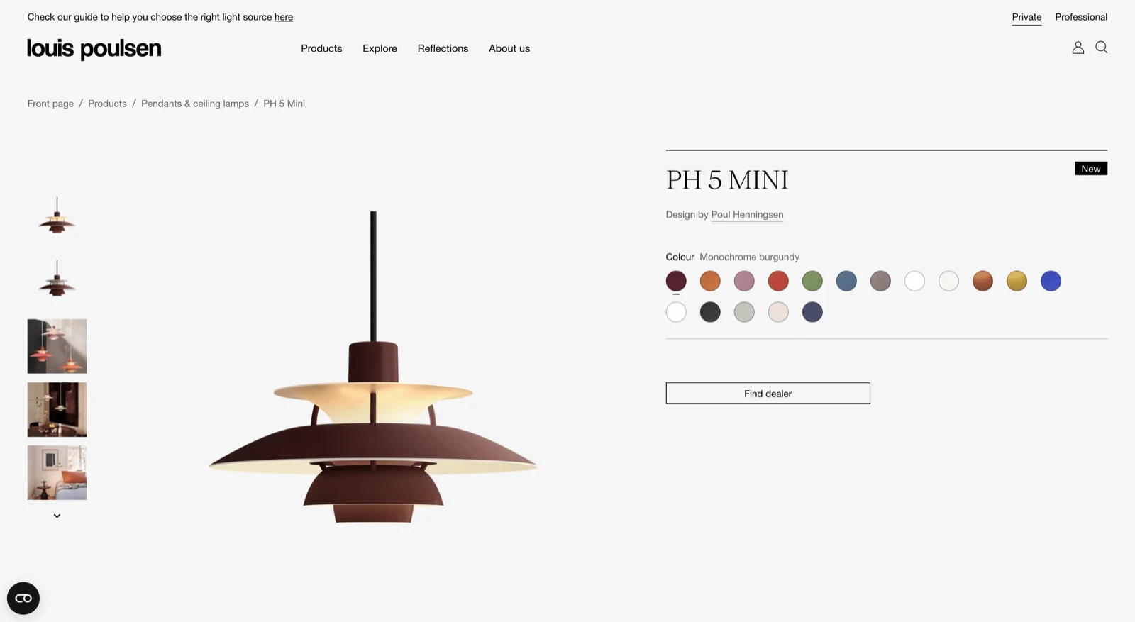
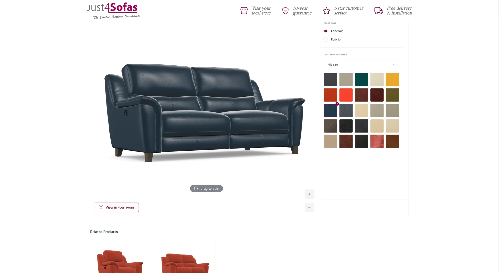
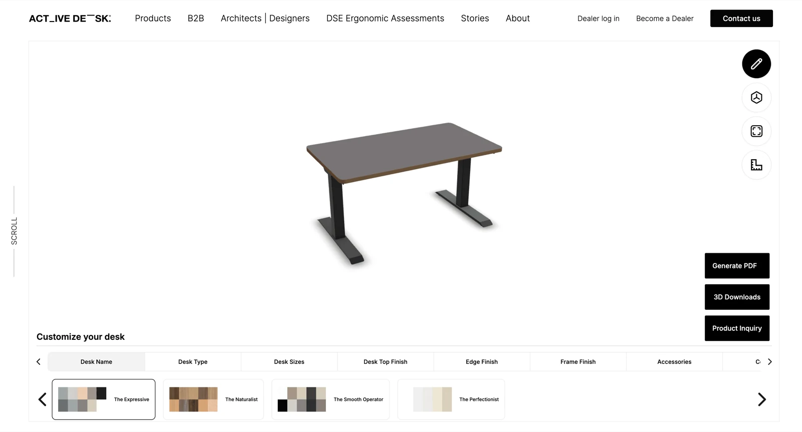
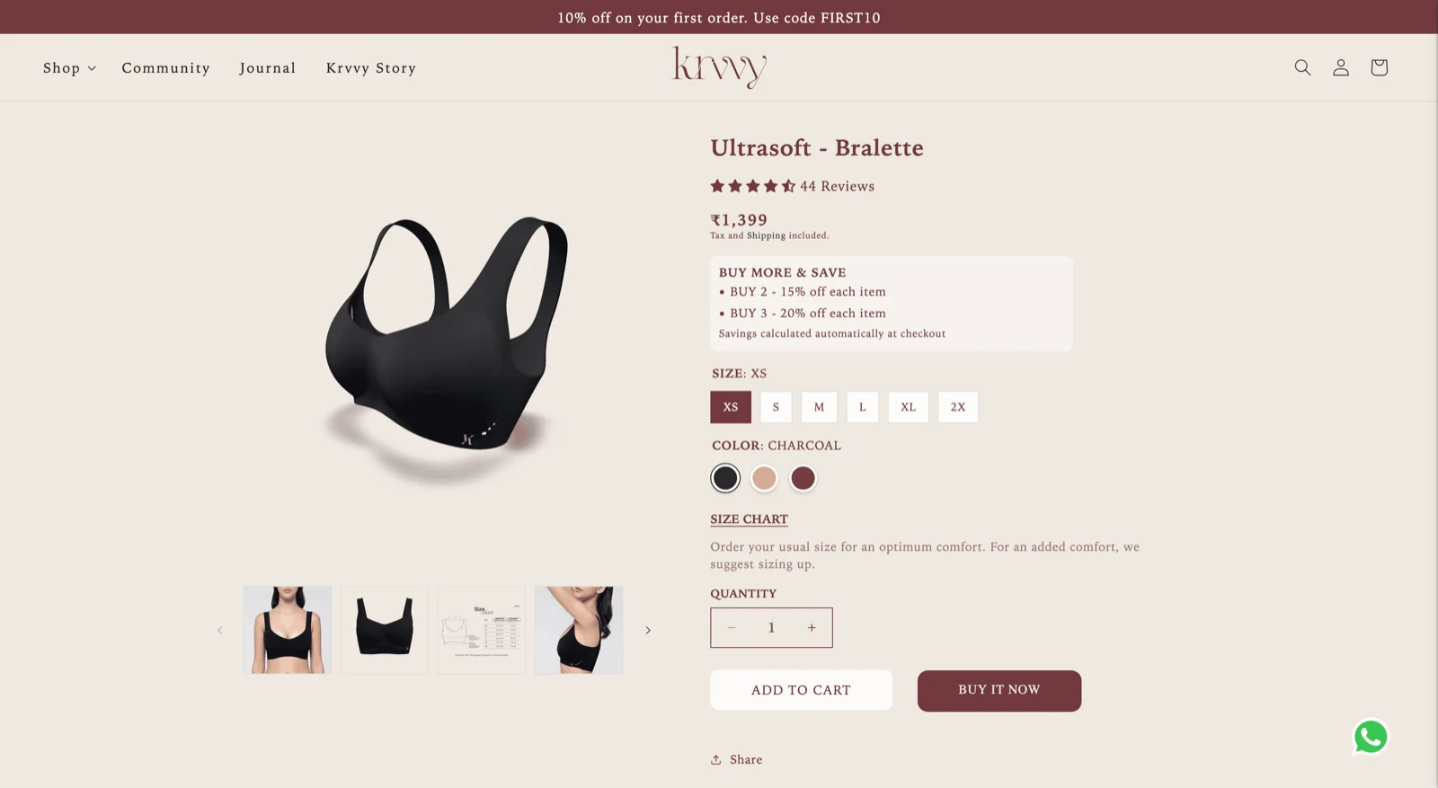
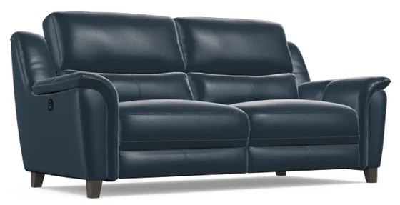
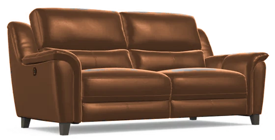
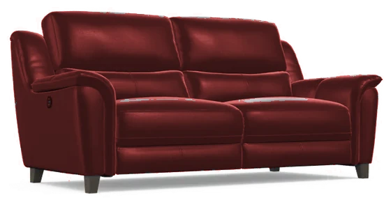
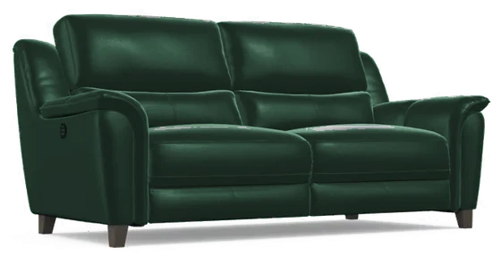
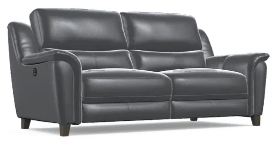
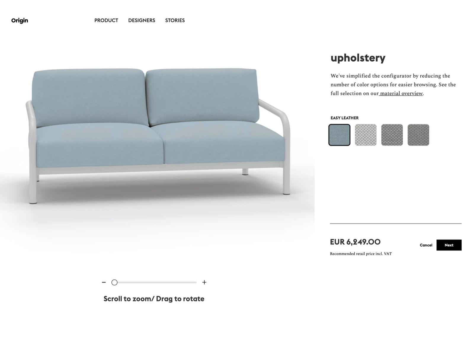
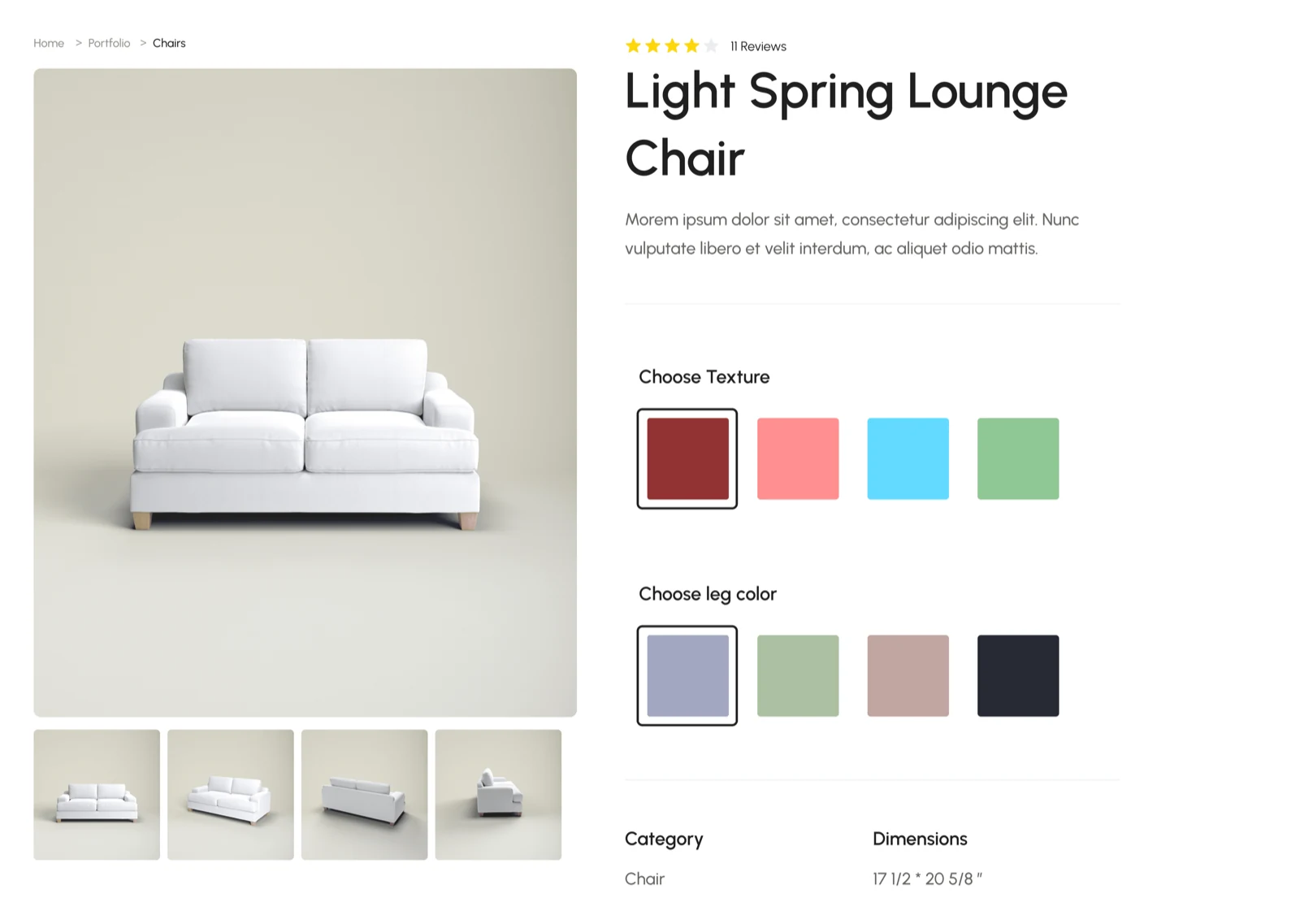
This is what the output looks like on a client’s storefront. Four categories, four separate builds, and before the platform, four times the work.
My role
An internal platform at Ikarus 3D, June to the end of August 2024. Design was two people: Dipanshu Saini and me. Around us: one co-founder running 3D, one product manager and two developers. I was on it until 4 July.
Discovery with the three teams, the platform's structure, the interface and the component system, worked through together with Dipanshu. After I left, the work was getting it live: connecting it with the developers' code, and small changes along the way.
Figma for wireframes and screens. Card sorting on a whiteboard, where the 3D artists grouped settings the way they think of them. Hero UI, a ready-made set of interface components, chosen with the developers.
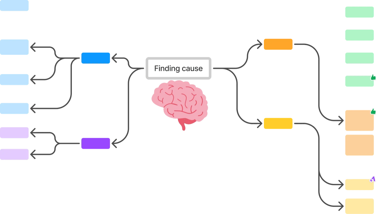
The research findings and the mind map that traced them to one cause, a close look at competitors' tools, the editor, projects and materials screens with written feedback on each, and ready-made themes for configurators.
The problem
The problem showed up in a monthly meeting between teams, not in any number. Two groups described the same project from opposite ends, and neither of them was happy.
The 3D artists were tired of feedback loops that never seemed to close. The developers were tired of rebuilding the same features for every new client. Between them sat a handoff where nothing the developers did could start until the artists were finished, and the artists were rarely finished when they thought they were.
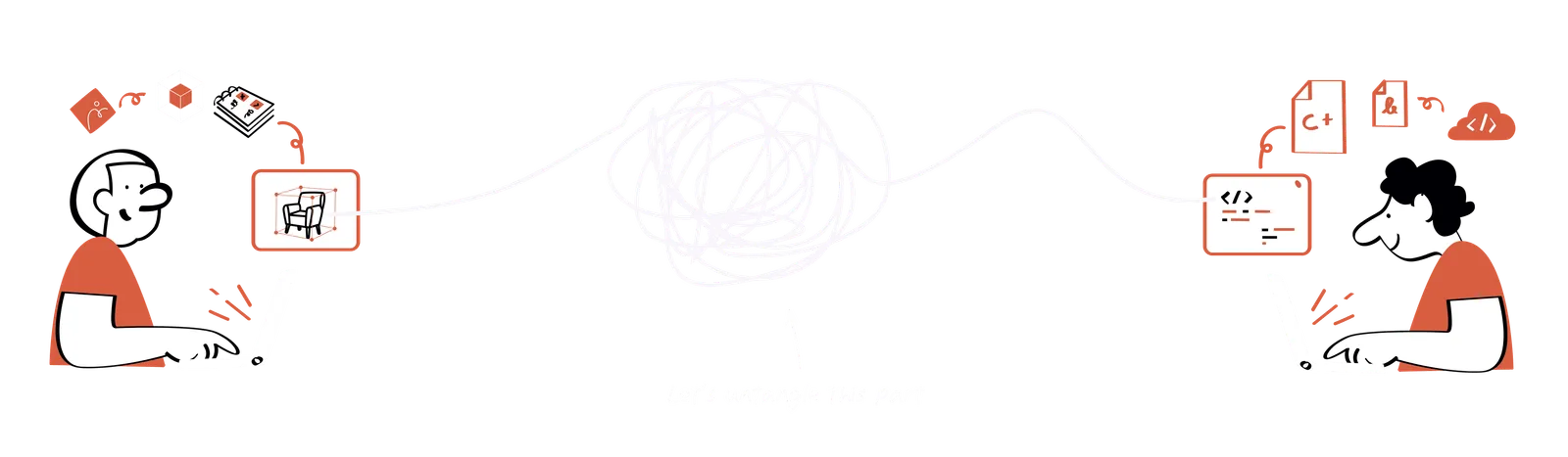
The product was strong. The way it got built was not.
How might we give three teams one place where a configurator lives, so checking it, building it and delivering it stop happening in different places?
What discovery found
Find the problems people had stopped reporting, the ones everyone had come to accept as "just how long this takes".
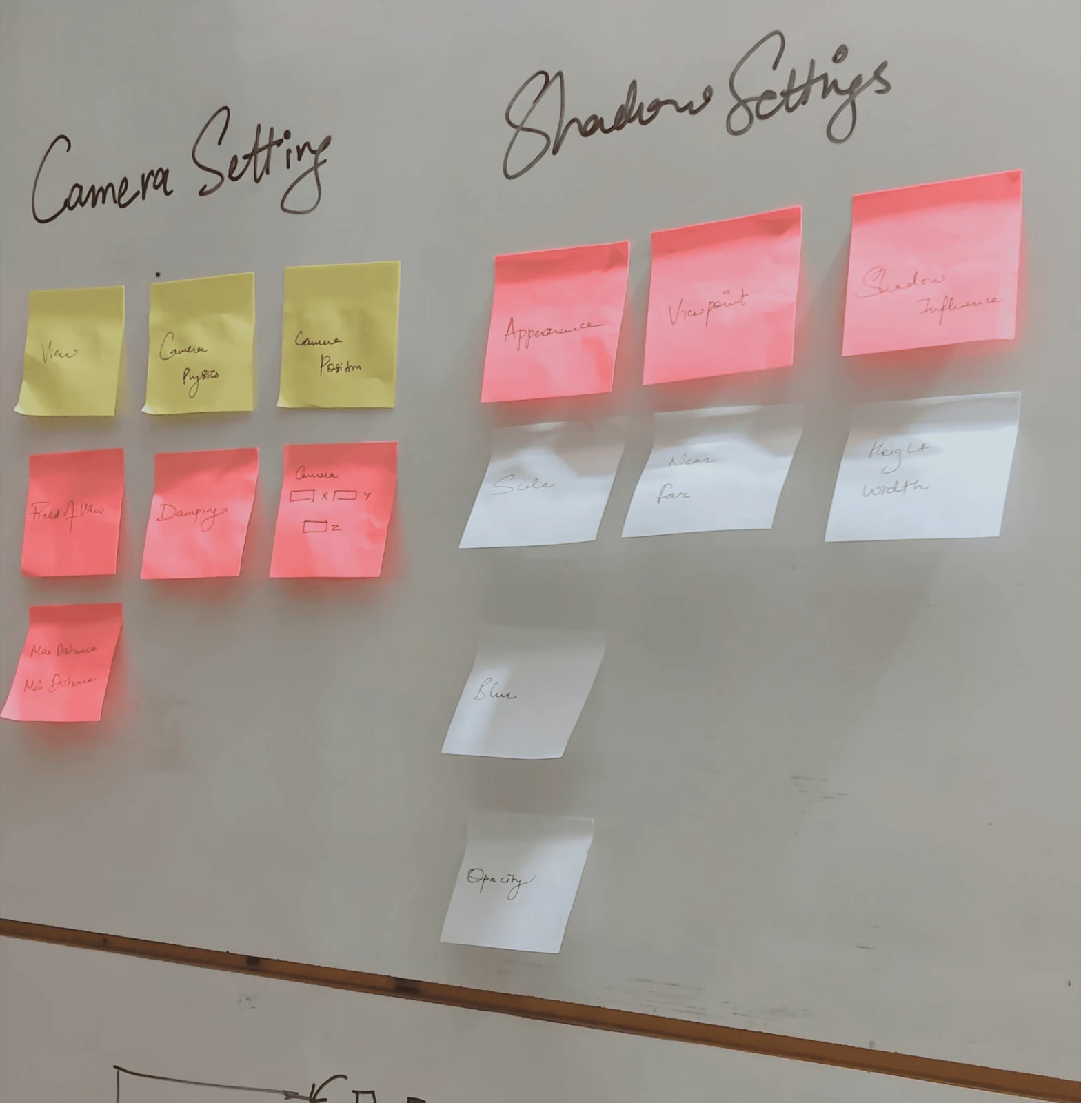
About a month watching each team's real working day, rather than interviewing them about it, plus a card-sorting session with the artists on the settings nobody could find.
Six complaints from two teams, each one a cost somebody had quietly accepted. Put side by side, they all came from one cause: there was no single place where a configurator lived.
The fix could be a single platform rather than six separate improvements.
For the 3D artists
- Two different pictures. Models were checked and approved in a testing program that didn't draw them the way a web browser does, so work that had passed came back wrong once it was on the website.
- Deadline pressure. Because revision rounds started after the work was supposedly done, the fixing happened late at night against a delivery date.
- Workflow chaos. Assets and change requests were tracked across several tools, so nobody could say where a model was without asking a person.
For the developers
- Reinventing the wheel. Around 60% of a developer's day went on rebuilding features that already existed somewhere else in the company.
- The handoff marathon. Ten to fifteen rounds of back-and-forth per configurator, treated as normal rather than as a problem.
- Maintenance over progress. More time went on fixing what had already been delivered than on building what was next.
Both sides were describing one problem from two ends. A configurator lived as a model in one tool, a spec in another, a chat thread in a third, and code in a fourth, and every gap between them was another round of fixes waiting to happen.
The goal
One environment. No code. Nothing built twice.
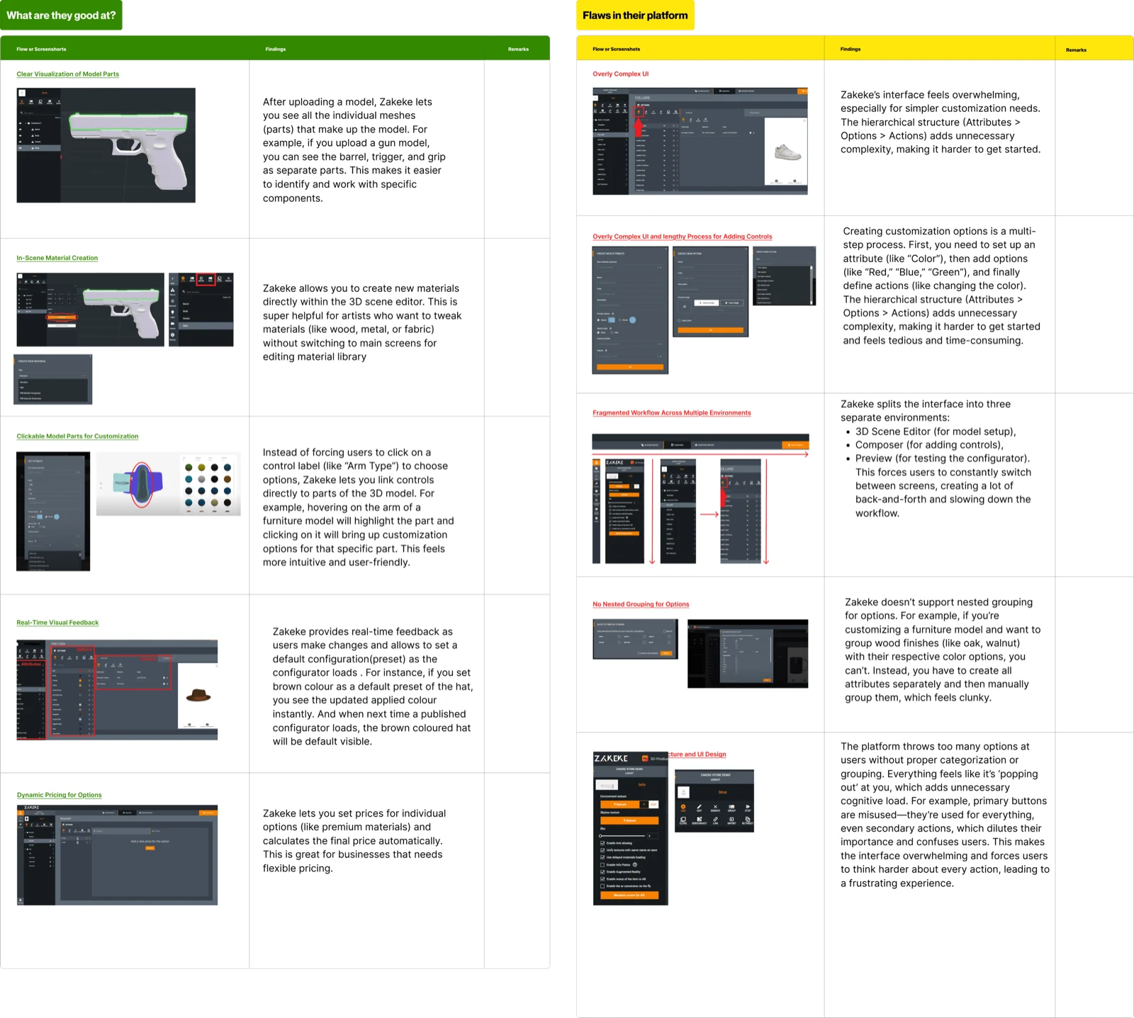
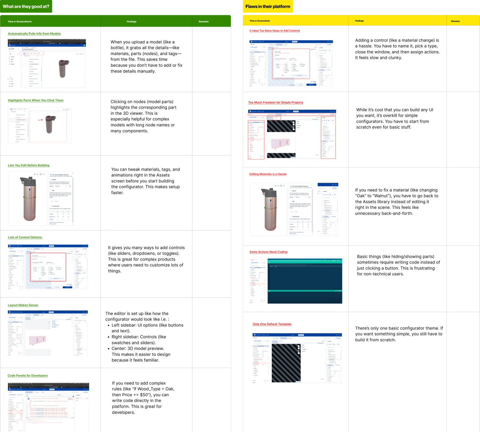
We looked at how other configurator tools already handled this, Zakeke and Combeenation in particular, to sort the ideas worth keeping from the traps.
Worth keeping
- Editing the model directly rather than through form fields beside it
- Hover states that explain what a control actually does
- Real-time feedback as settings change
- Product details (metadata) filled in automatically instead of typed
Worth avoiding
- Interfaces dense enough to need a training session
- Control setup that becomes its own busywork
- Anything that requires the user to write code
- No way to start from anything but a blank file
That left a gap: one tool where everything happens in one place, with settings anyone can set up without code, and templates to start from. We set four principles to judge every screen against:
Simplify
Shorten the path from a set of models to a finished configurator, ready for a website.
Empower
Let a non-technical user do work that previously required a developer.
Maintain
Make the result something you can change after it goes live, without building it again.
Reuse
Anything made for one project should be there for the next one.
How the editor is organised
Decide the layout of the editor, the screen artists would spend most of their day in.
Looked at where the output ends up. A configurator's final home is an online product page: model on one side, options on the other.
The artists were already fluent in that layout, because it is the one their work ships into. And if the editor draws the model the same way the website does, what an artist approves is what a shopper sees.
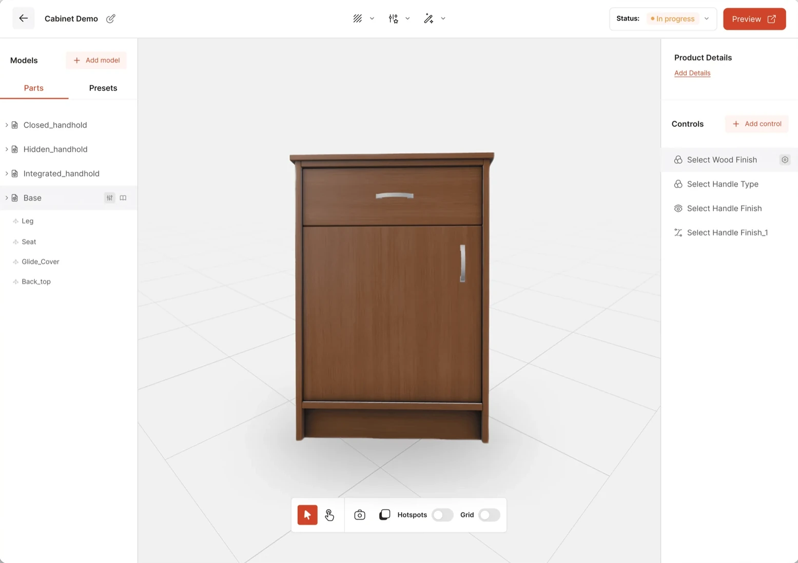
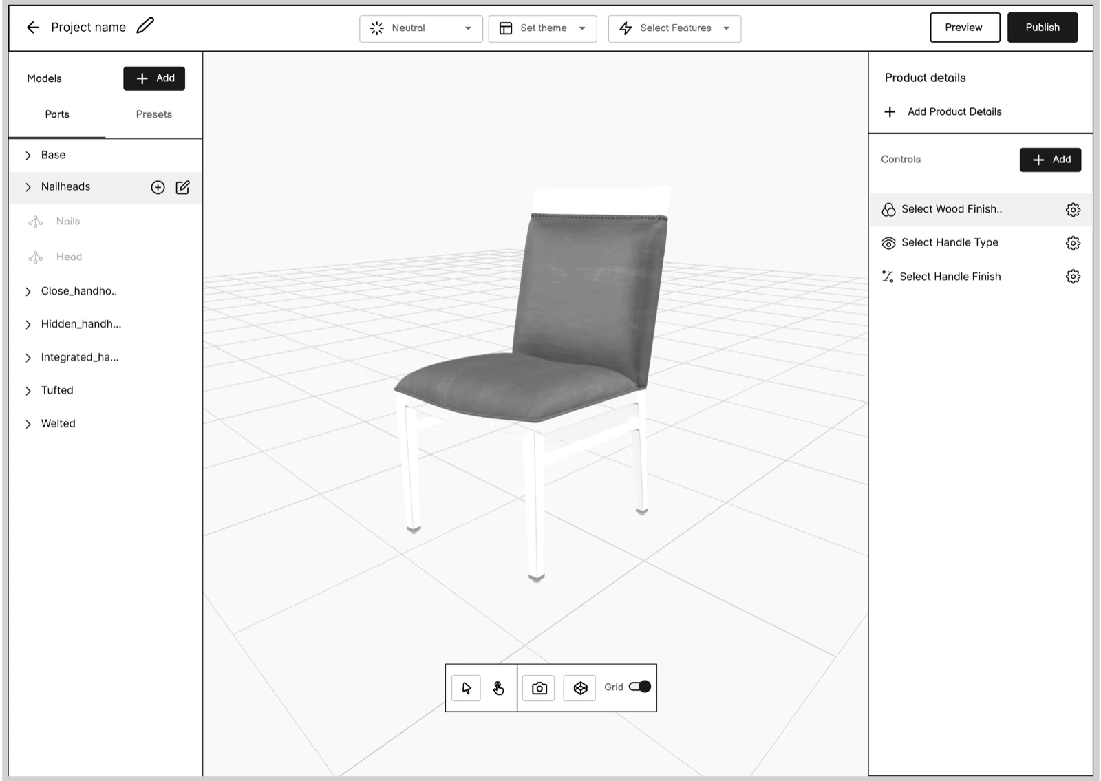
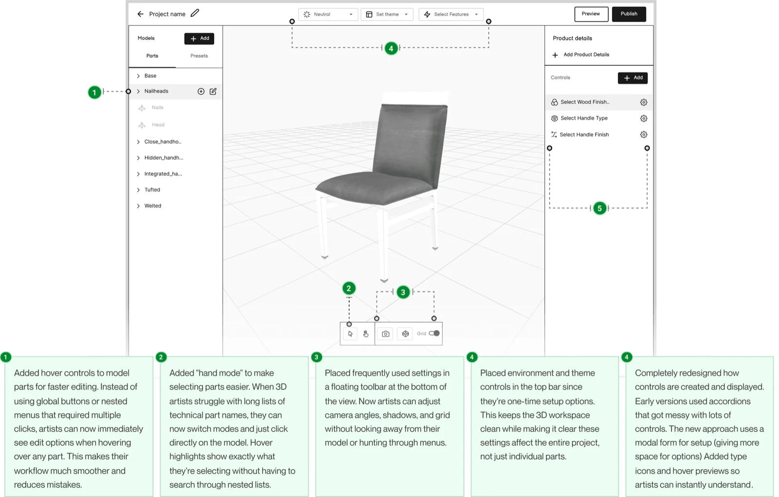
The editor is laid out like the product page, part for part, and draws the 3D model with the same software the shop uses. That is what stopped the rounds of fixes from happening at all.
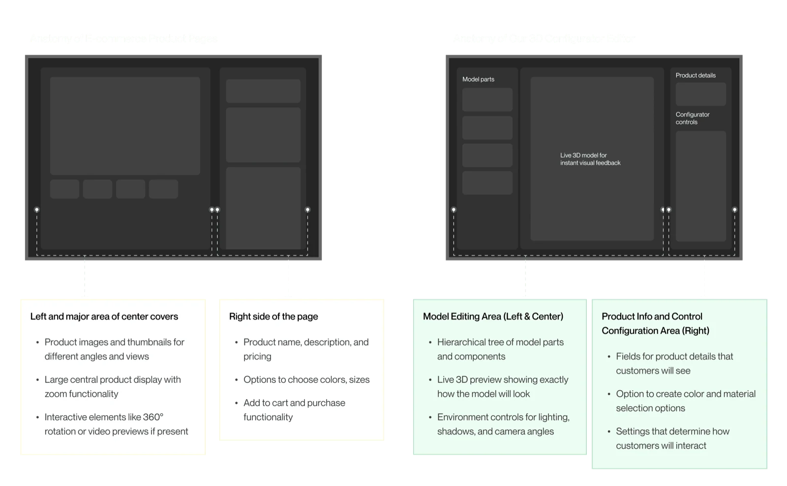
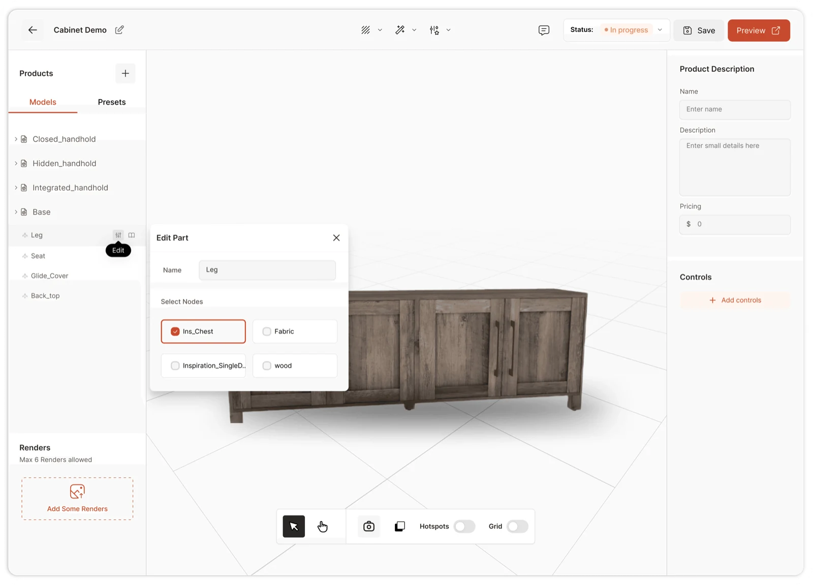
The scene editor, mirroring where the output ends up
- The model, livedrawn exactly as the shopper will see it
- Options panel, rightexactly where a product page puts them
- Environment & lightinga small pop-up panel, so the model stays in view
- Theme & versioningin context, not on their own screens
Review it where it will actually live.
Most of the ten to fifteen rounds were not disagreements about the work. They came from the model looking different in two programs, found out late.
The platform, screen by screen
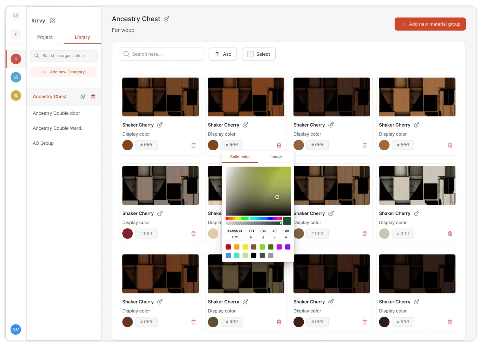
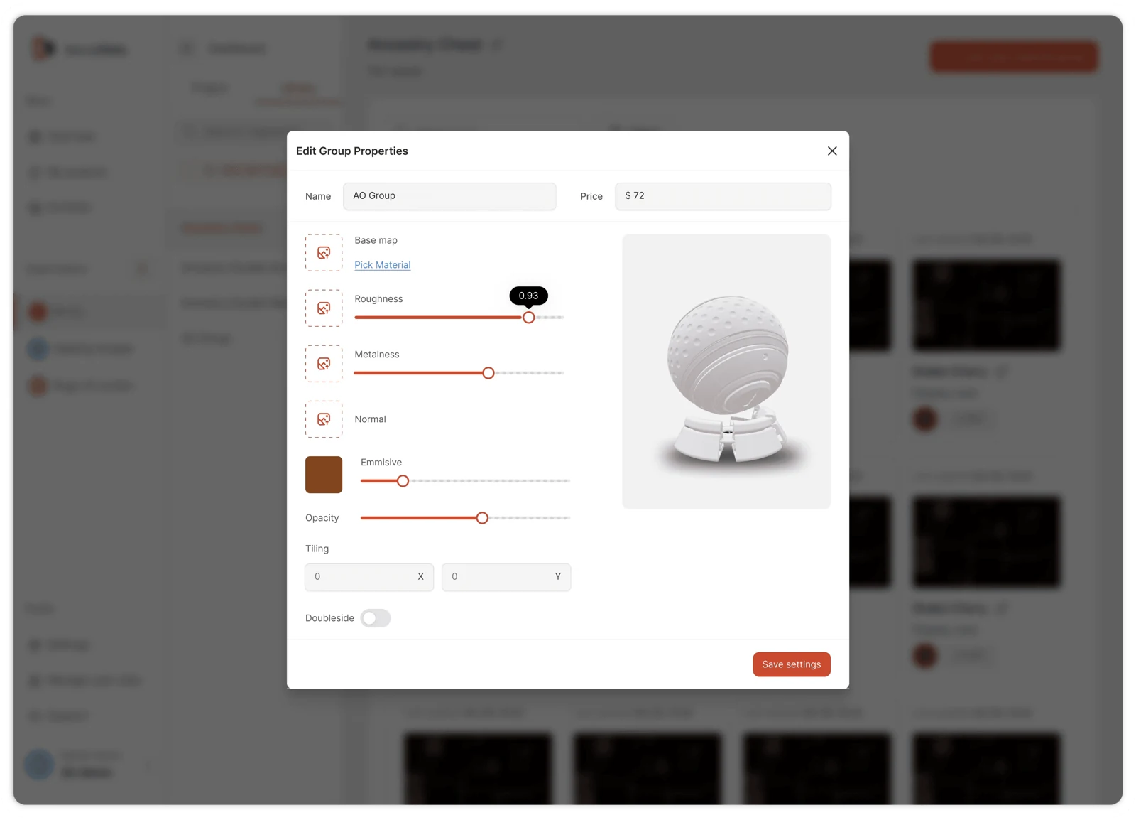
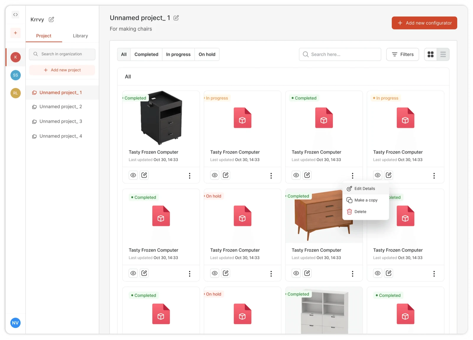
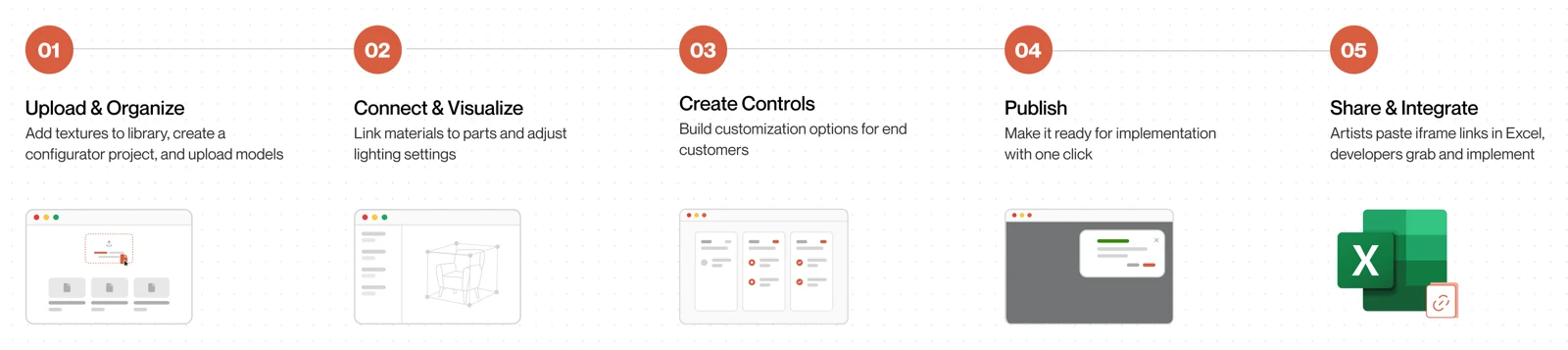
- ProjectSet up the catalogue
- SceneLoad and stage models
- MaterialsPull from the library
- ControlsNo-code, live preview
- EmbedOne line pasted into the website
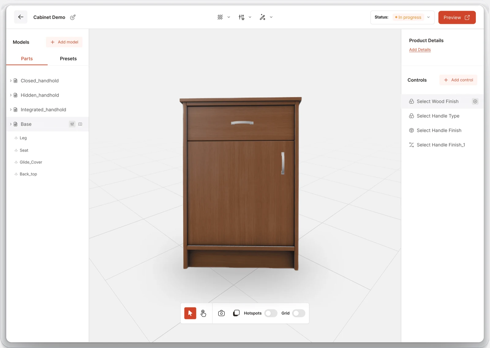
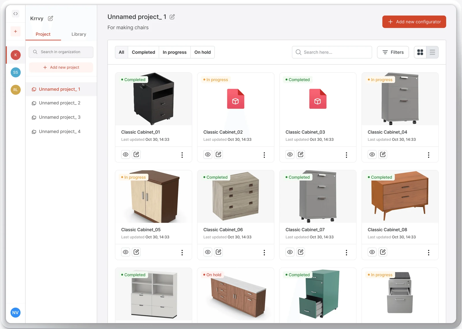
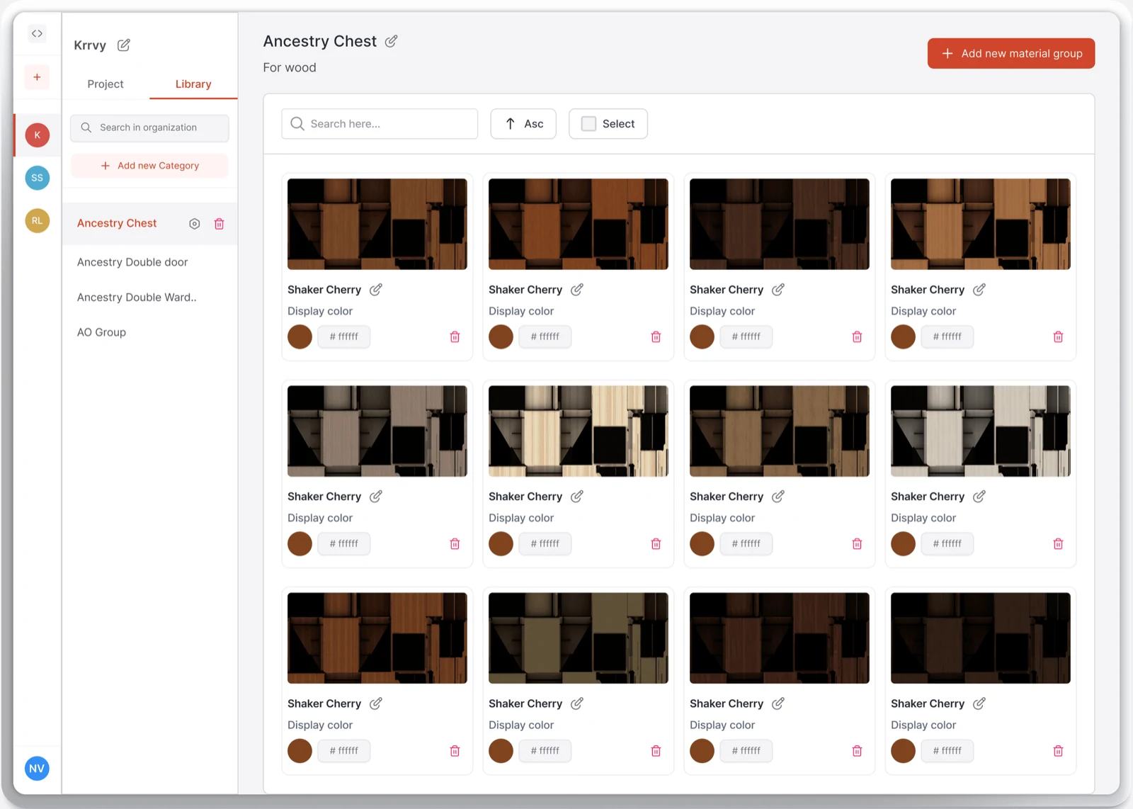
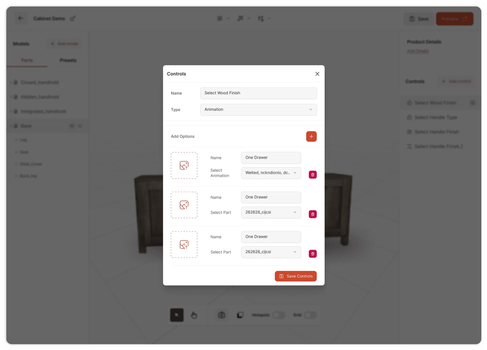
Frequent adjustments (lighting, background, theme, version) sit in small pop-up panels rather than on their own screens, so the model never leaves the frame while you change it.
Watch it in motion: the Delta configurator, end to end ↗
Getting there
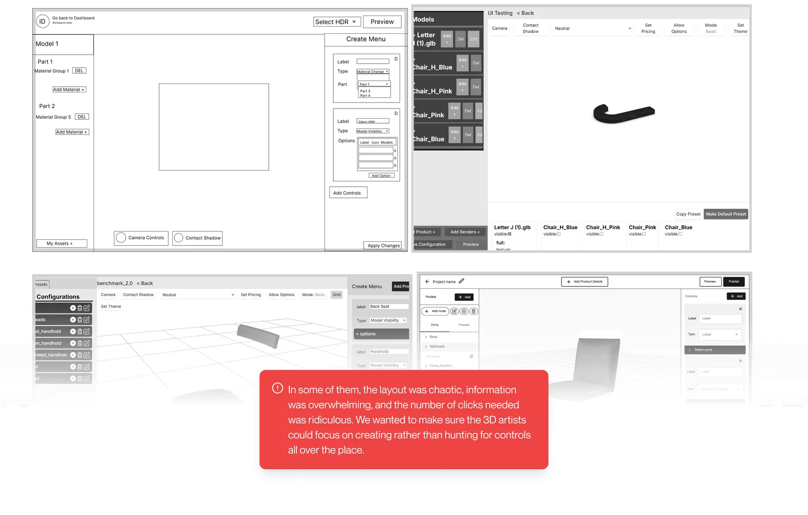
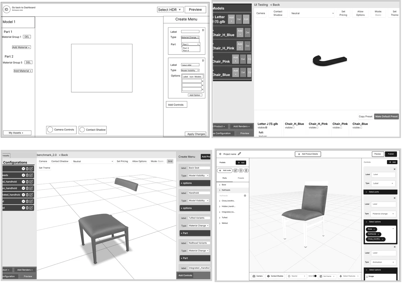
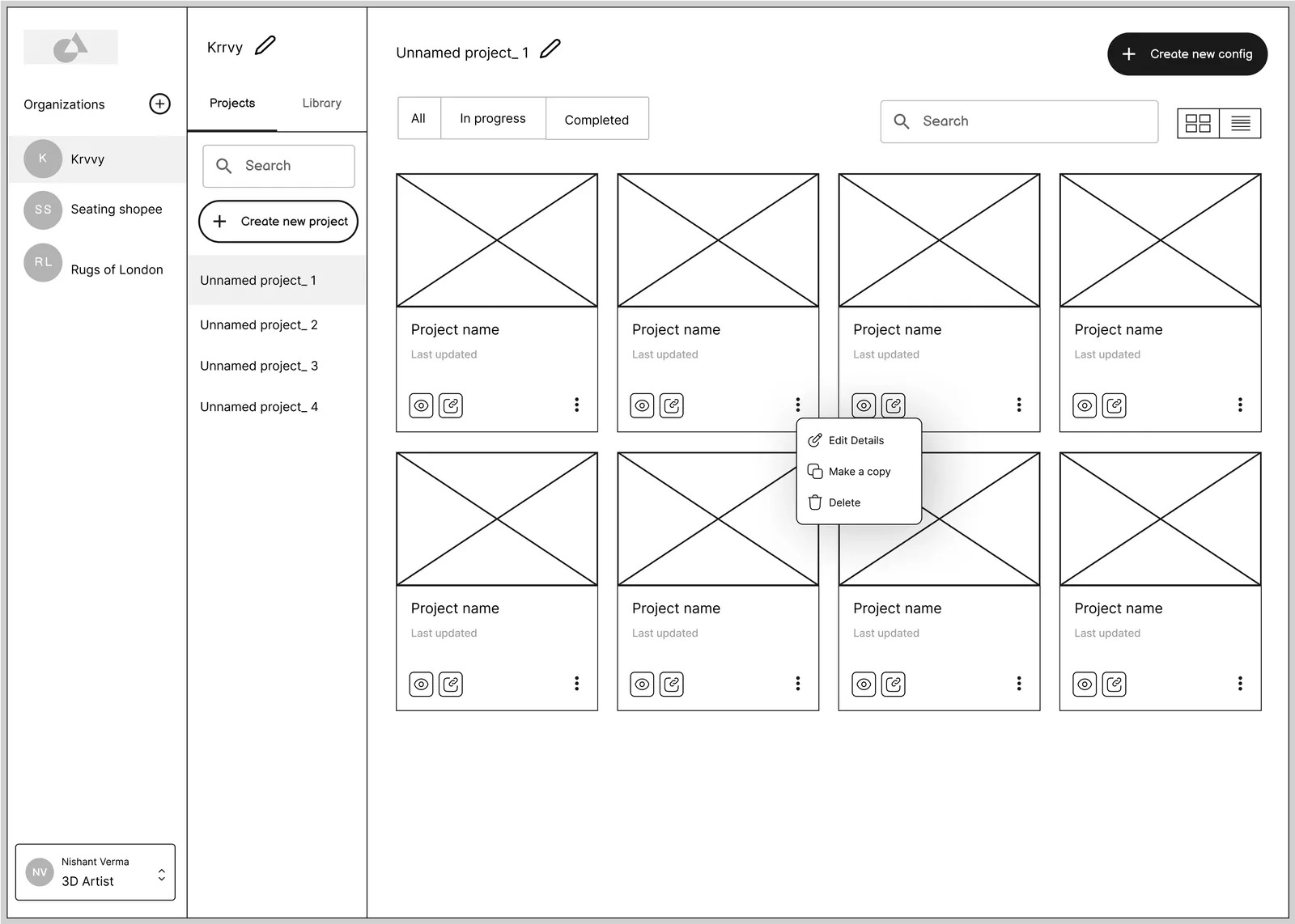
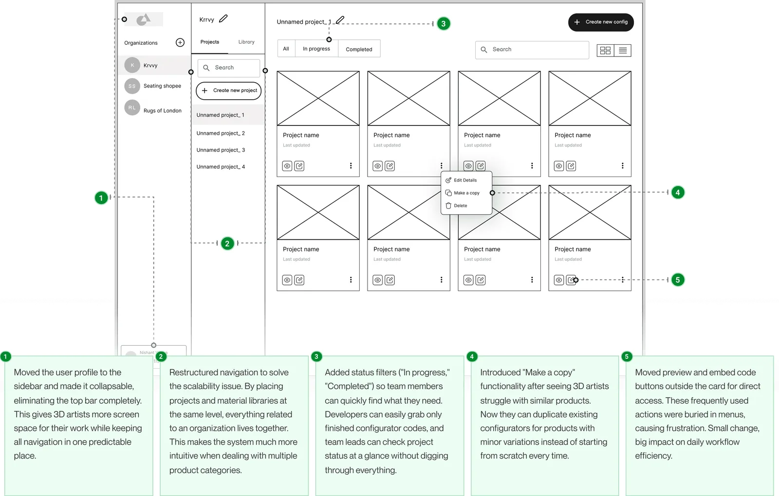
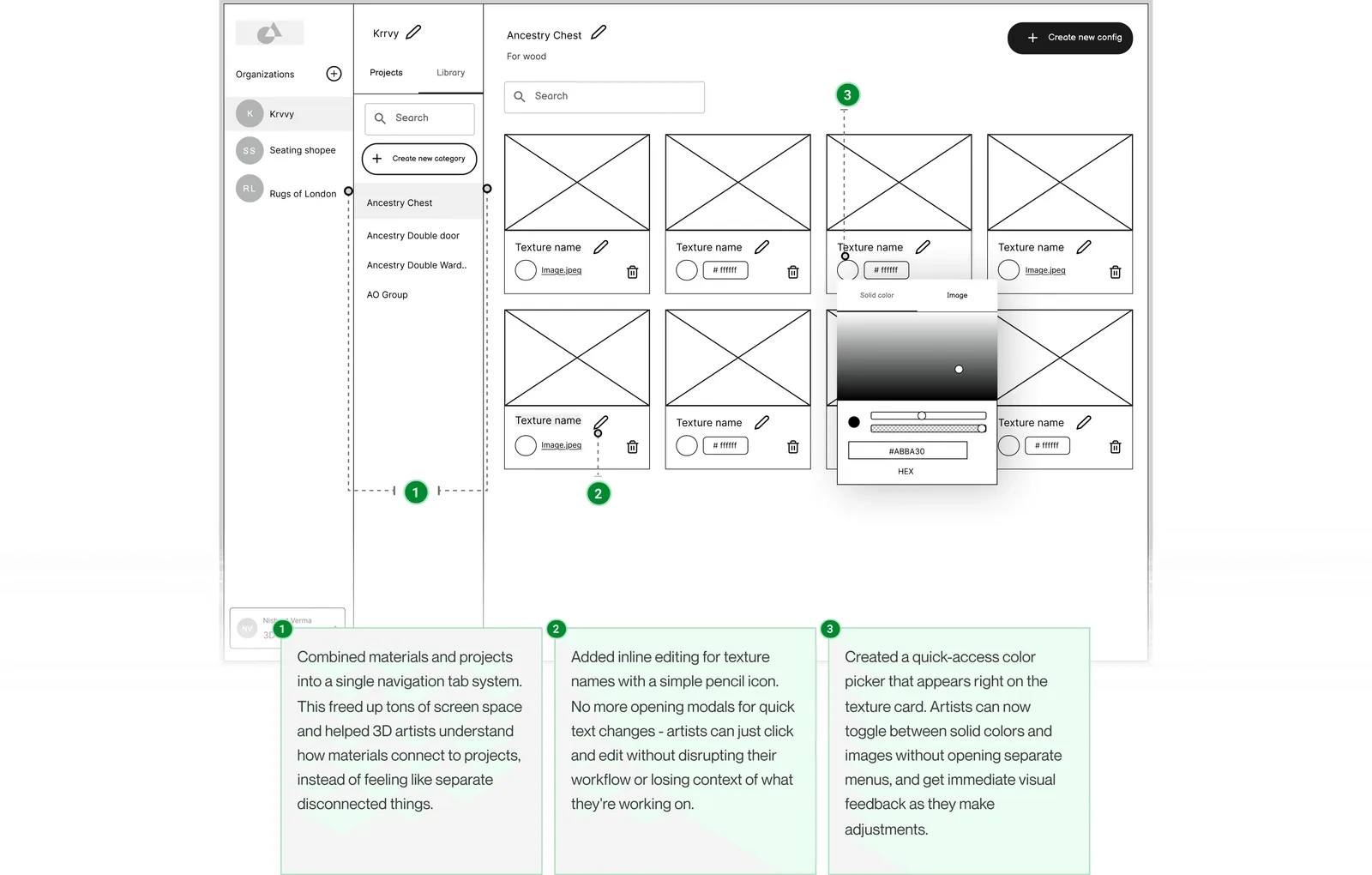
None of these landed first time. Each screen went through a wireframe, a round of written feedback from the team it was for, and a rebuild.
Scene editor. The first layouts put every setting on screen at once. Each round took something off the canvas until the model had the room.
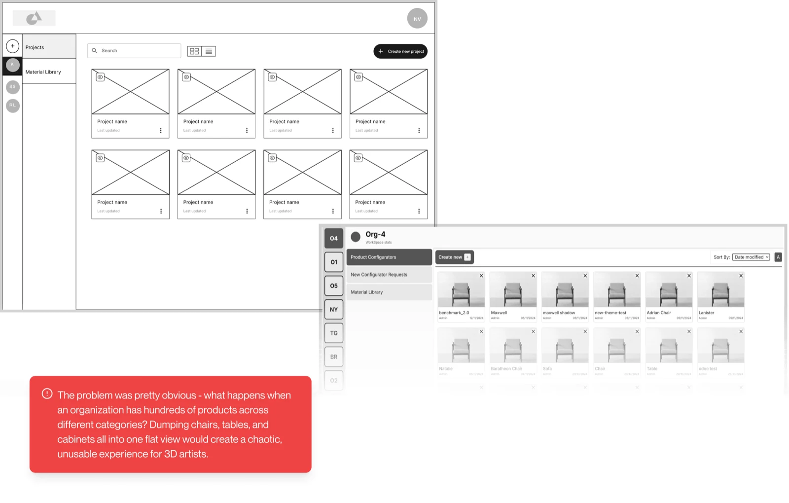
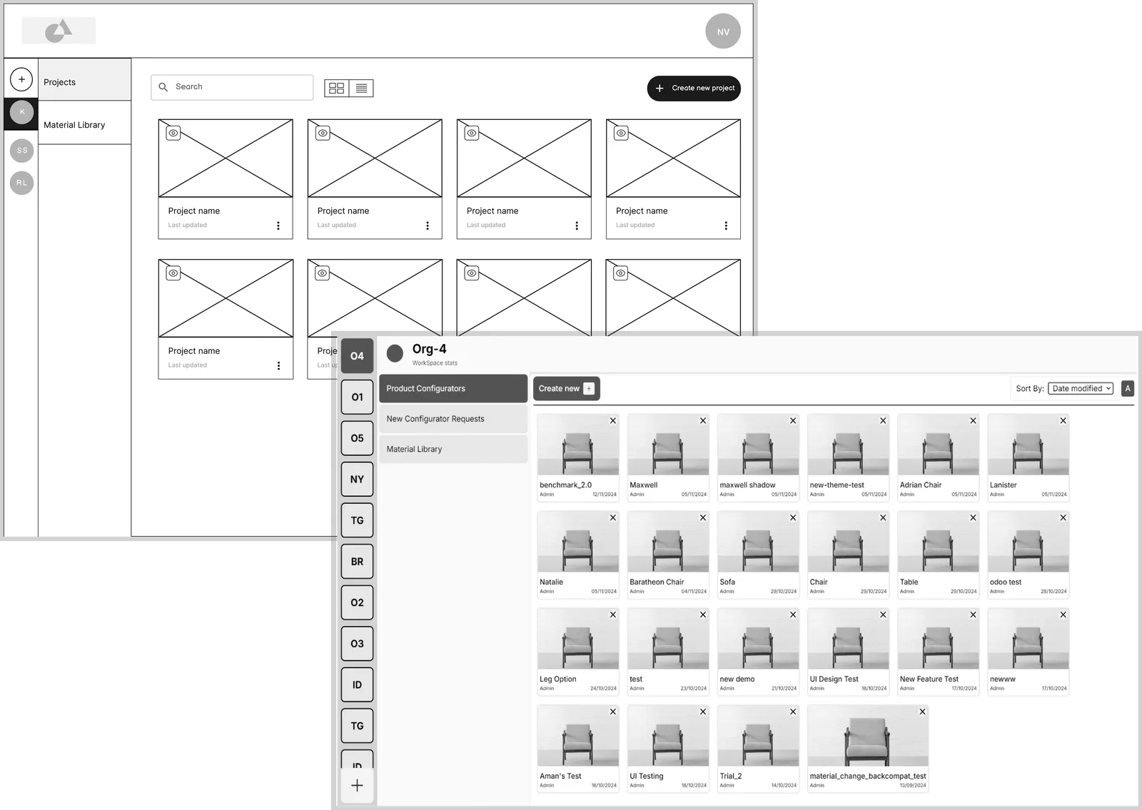
Projects. One flat view of every product stopped working the moment an organisation had hundreds of them.
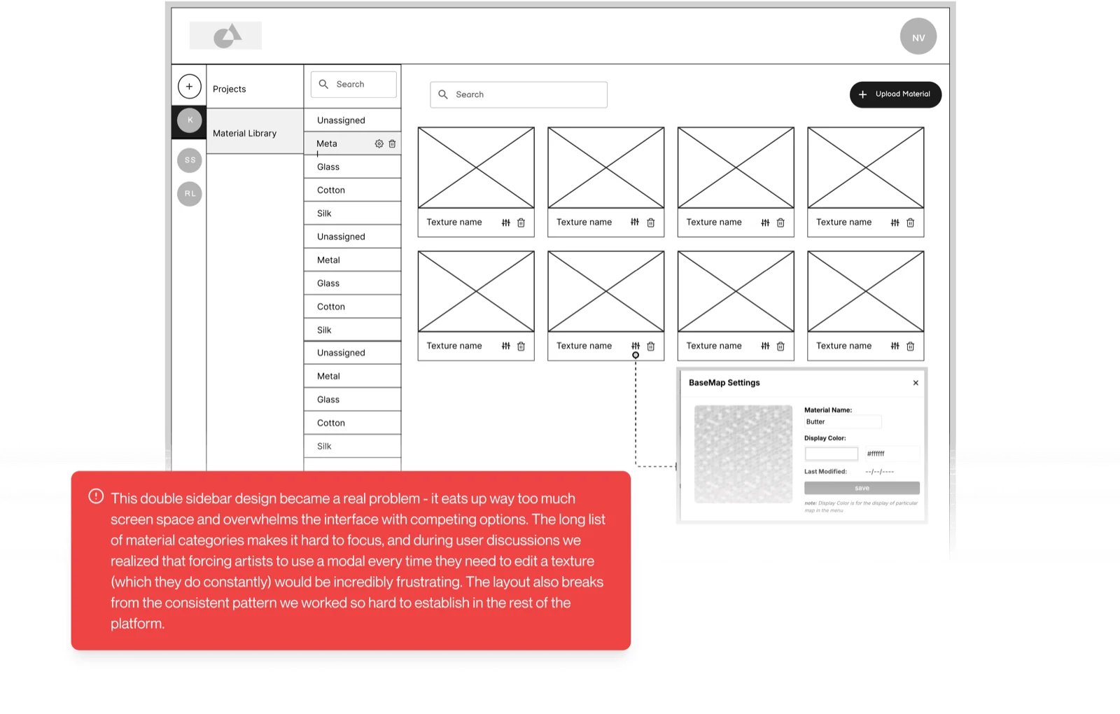
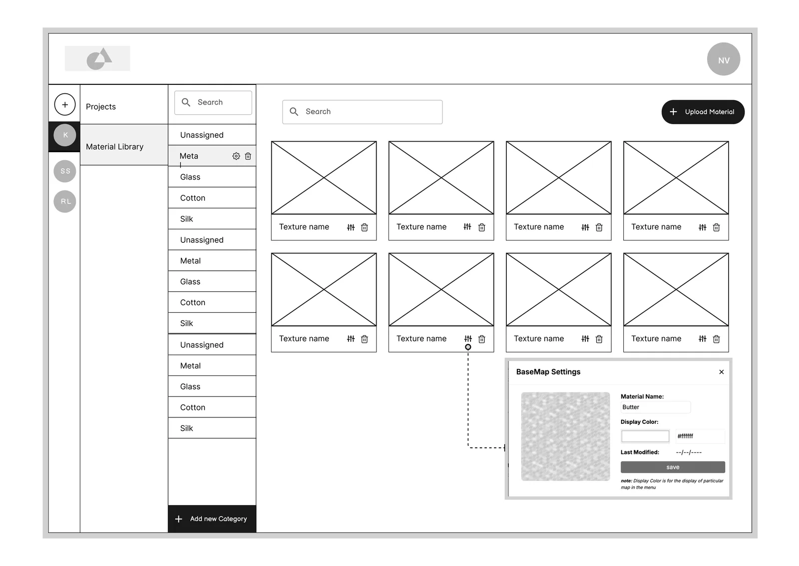
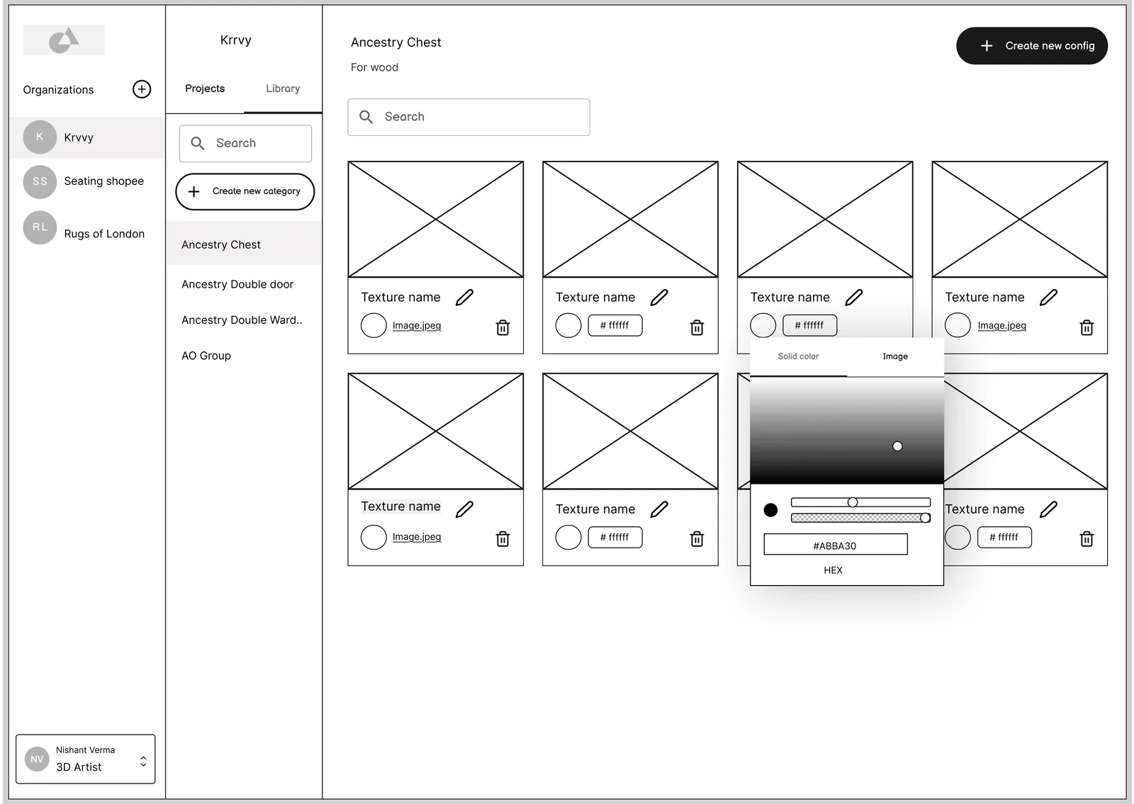
Materials. A second sidebar for material categories split the screen in two and hid the textures themselves.
Design language
Borrowed on purpose. Three months is not long.
- Components
- Hero UI, chosen with the developers over building a custom set: the most complete coverage, actively maintained, and it shipped both themes out of the box.
- Themes
- Light and dark from day one, because the 3D artists work against dark backgrounds and the managers do not.
- Templates
- Configurator themes are templated per product category, so a new client starts from something rather than from a blank file.

Hero UI, themed to the brand
Status
Picking a component library reads like a visual decision and is really a scheduling one. It set how fast two developers could move for three months, which mattered more than any amount of custom styling would have.
The one place the platform gets styled is the output. Configurator themes are templated per product category, so a client’s storefront gets something that looks like their brand rather than like our tool.
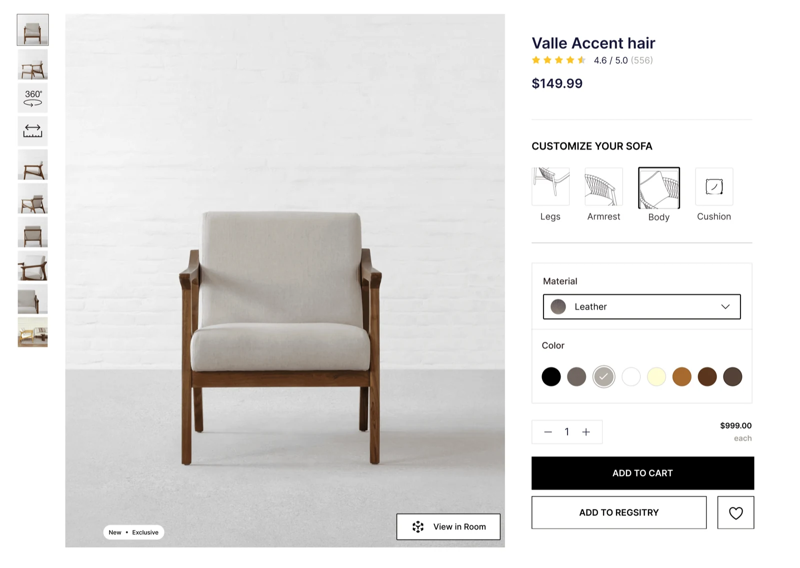
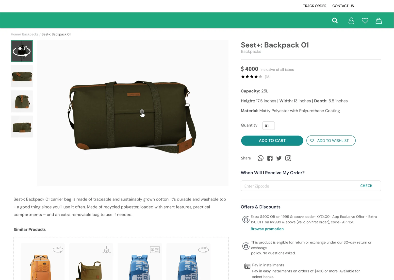
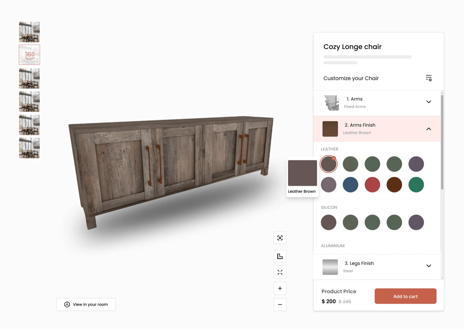
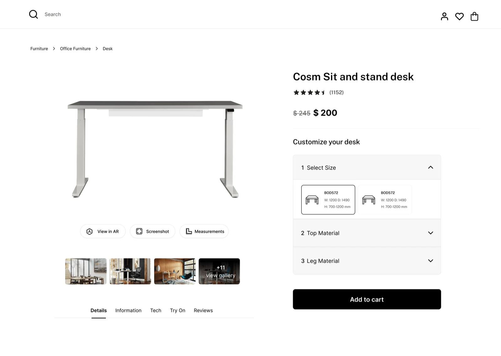
Decisions and trade-offs
A material library, not a model library
- Decision
- Invest in a deep, well-organised library of materials and textures rather than a library of finished models.
- Because
- The original plan assumed models would be reused between clients. They are not: the team builds each one from scratch against client photographs. The genuinely reusable layer was one level down, in the materials. Finding that out changed the roadmap.
- Result
- A narrower feature, and a far more useful one. The library keeps growing: each project leaves the next one more to start from.
Ship on someone else's components
- Decision
- Use Hero UI as it comes, typeface included, rather than design our own set of components.
- Because
- Two developers, three months, and an internal tool whose value is entirely in what it does. A custom set would have looked more impressive, and launched later.
- Trade-off
- The platform does not look like anything in particular. For a tool used by four people inside the company, that was the correct thing to give up.
Fit the spreadsheet instead of replacing it
- Decision
- Integration is a single embed link, pasted into the spreadsheets the team already tracked projects in.
- Because
- The elegant answer was to absorb tracking into the platform. The workable answer was to require nobody to change how they already worked.
- Result
- Adoption needed almost no training and no rollout plan, which for an internal tool is most of the battle.
In-platform messaging
Cut- Decision
- Dropped from the first version. Artists and developers keep talking wherever they already talk.
- Because
- It was the obvious nice-to-have and the obvious thing to lose. Shipping something the team could actually use beat shipping something complete.
- Trade-off
- Conversations stay outside the platform, which is a real cost, just a smaller one than launching three months late.
Outcomes
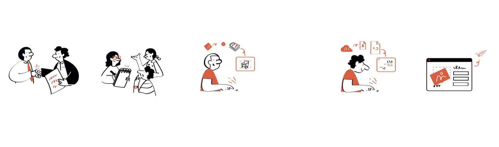
How things improved
Faster configurator builds
Three weeks became seven days, and the ten to fifteen rounds of revision went away as a stage.
Delivered on time
Up from 40% of projects landing when promised. Predictability mattered as much to the business as speed.
Two teams, two tracks
Artists build configurators without waiting on developers, and developers stop waiting on model updates.
A sales tool, by accident
Configurations could be shown live in a pitch instead of played as a video, which helped win larger clients.
Nothing new to learn
The 3D artists kept their spreadsheets and simply pasted a link in when a configurator was done.
What I learned
One platform that replaced a custom build per client, cut build time by 70%, and removed the revision loop as a stage rather than shortening it.
Watch the work, don't ask about it. The mismatch between the two programs was the single most expensive problem in the whole process, and nobody raised it in a meeting, because it had stopped registering as a problem. A month inside the work found it; a round of interviews would not have.
Check the assumption under the roadmap before drawing anything. An entire planned feature rested on models being reusable. They were not. The cheapest moment to discover that is before the first wireframe, and it was very nearly missed.
Leaving a project cleanly is its own skill. I handed this over five weeks in. What made that work was that the discovery and the reasoning were written down rather than held in my head, and I now treat that as part of the job rather than an extra.
In short
This project replaced a custom build per client with one platform where a configurator is made, reviewed and delivered in the same place. It set out to remove a ten-to-fifteen-round revision loop and did so by making the place a configurator is checked the place it ships from, which took build time from three weeks to seven days and on-time delivery from 40% to 90%. My part was the discovery and the early structure, worked through with Dipanshu; the plain, paste-one-link way of connecting it is why it got used.
Next case study
Renderly · Ikarus 3D
A marketplace both sides trust
An online shop for files you 3D print at home. Artists sell their models and raise money for new ones; buyers see photos from other buyers, so they know a file will print before they pay. I designed the shop, the model page and the tool artists use to build a campaign.
Read it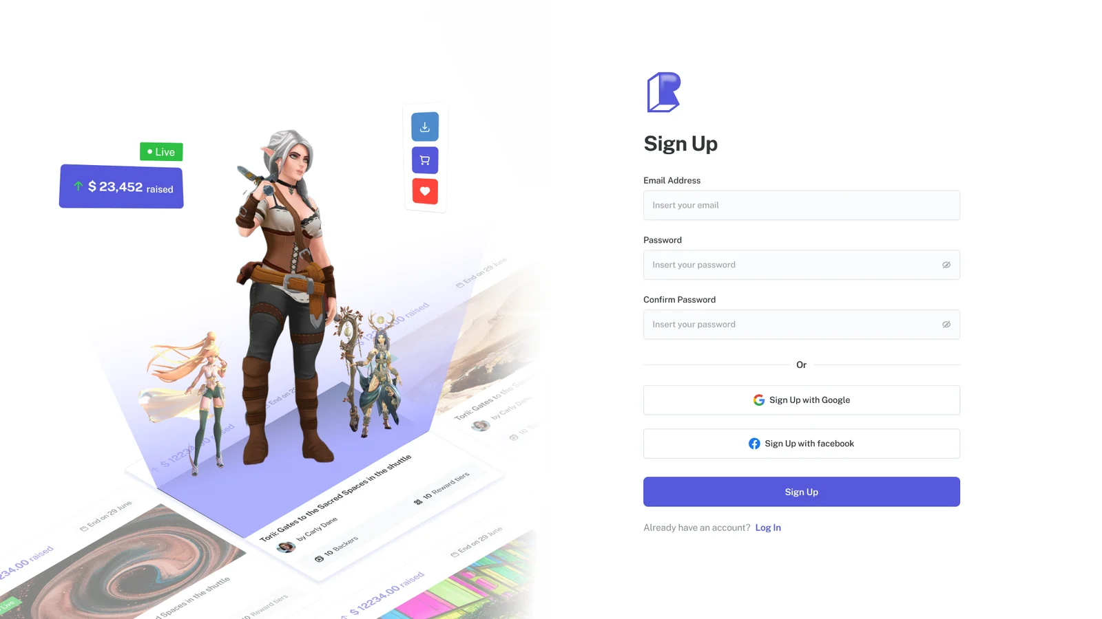
More work
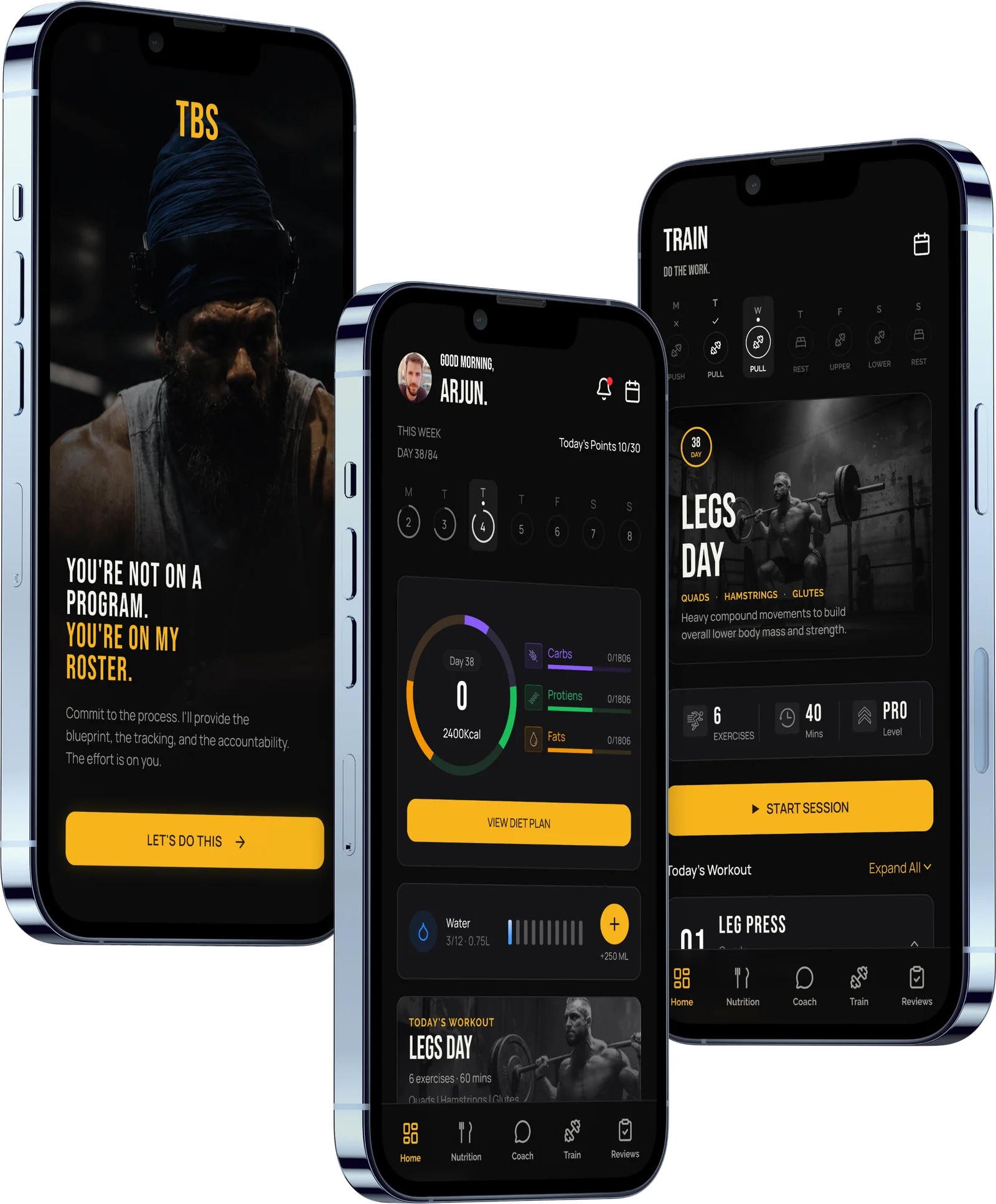 TBSTurning one-on-one fitness coaching into a product that can scaleA coaching app built around the one question a client asks every morning: what am I doing today? Five tabs, today's meals and workout up front, and a direct line to their coach.Read the case study
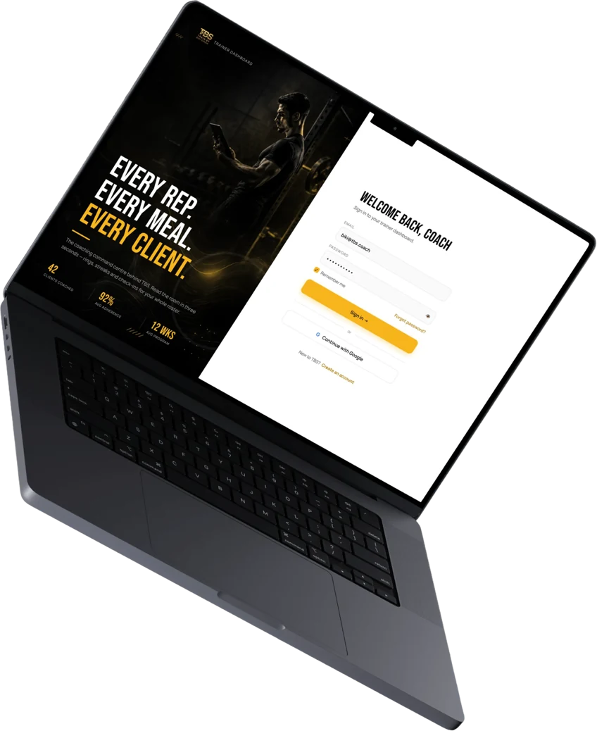 TBSReplacing a fitness coach's scattered workflow with one clear workspaceThe coach's side of the same product. A workspace that opens on one ordered list, who needs attention today and what each of them needs, with a plan builder to answer it.Read the case study
 3D artists said
 Developers said