Renderly · Ikarus 3DCase study
A marketplace both sides trust
An online shop for files you 3D print at home. Artists sell their models and raise money for new ones; buyers see photos from other buyers, so they know a file will print before they pay. I designed the shop, the model page and the tool artists use to build a campaign.
Overview
Renderly was an online shop for 3D-printable files: digital models you download and print on a 3D printer at home. Two kinds of people use it. 3D artists sculpt the models and sell them, either one at a time or through a campaign, where fans pay upfront for a new set of models and get rewards in return, the way Kickstarter works. People with 3D printers browse, buy a file, and print it.
Ikarus 3D was a studio that made 3D models for brands. Renderly was its first product for everyday people, and it started from one big idea: stop people copying files by never letting the file leave Renderly. Some screens below still carry its earlier name, Ikarus Nest.
I joined the design team to work on the marketplace and creator screens. In a team of three designers, I owned how the shop was organised, its main screens, what each screen shows when it is empty or something unusual happens, and a set of reusable pieces (buttons, fields, cards) for the design system. The research that changed the product’s direction was the team’s work, and this page says we when describing it. The design work after it is where I say I.
In the end the shop, the campaign builder, a statistics page for artists and the design system all went to the developers with every screen’s behaviour written down.
The short version
Renderly was built around stopping piracy: people copying and sharing files without paying. Nobody had asked the artists whether that was what they wanted.
We talked to 43 people. Every artist brought up piracy before we asked, and almost none wanted it fixed. They wanted more buyers to find them, to get paid on time, and to see what was selling. Buyers wanted to keep the file.
Sign-up, the shop, model pages that show photos from real buyers, a six-step campaign builder, a statistics page, and the component library. Each one ties back to something people told us.
My role
Ikarus 3D's in-house product, 2023 to 2024. A design team of three, plus product and engineering. I was a UI/UX designer on the team, not its lead.
How the shop and the artists' screens fit together; the Explore, model page, campaign and statistics screens; every empty screen; and the reusable components. I also ran some of the interviews and brought in people from my own tabletop and D&D circles.
Figma, before it had Dev Mode (the view developers use to read a design), so I wrote how things behave as notes on the screens. Interviews ran over Discord, Facebook and Instagram messages.
Sign-up, Explore, the model page, the campaign builder, statistics, the gate for adult content, what happens when an artist deletes a model, six empty screens, the notes for developers, and the colour, type, field, button, alert, label and card components in light and dark.
Credit, and what was mine
The research was the team's work. Members of the team held the community relationships that made 43 interviews possible at all. I ran interviews and brought in participants through my own contacts, but I did not lead it. The research sections below say we for that reason. The design sections after them are where I say I.
The problem
A 3D model is a file. Once a buyer downloads it, the artist has no control over what happens next. Copies spread. Licences exist, but nothing enforces them after the download.
The big idea was piracy protection. Remove the download, remove the problem.
So Renderly was planned around taking the download away. An artist could limit how many times a buyer could print a model, and the file would never leave Renderly. Buyers would get it ready to print inside the website, with a built-in slicer (the software that turns a 3D model into instructions a printer can follow), and Renderly would send it straight to the printer over wifi.
- LicenceThe artist limits how many prints
- No downloadThe file never leaves Renderly
- Cloud slicerPrepared in the browser
- SenderSent to the printer over wifi
- PrinterIt prints; the buyer never gets the file
That was our hypothesis. Then we went and tested it.
How might we build a marketplace that both sides trust on day one, when there is no history yet to trust?
What we learned from 43 people
We tested the hypothesis with 43 people: 27 artists who sell for a living, several of whom had raised $250,000 to $680,000 on Kickstarter and MyMiniFactory (sites where fans fund new work), and 16 people who own 3D printers.
"The cost of doing business"
A studio that had raised over $250,000, on piracy.
"Free copies are marketing"
An artist, on the people sharing his files.
"Nothing to be done"
An artist whose work circulated on Telegram.
"Everyone likes their own slicer"
A printer owner, on being locked into ours.
Every artist raised piracy before we asked, and almost none wanted it solved. Buyers wanted to own the file, and most of their printers had no wifi.
The turn
The research did not adjust the product. It changed what the product was for.
Piracy protection moved down the list of things to build. The first version became a shop, campaigns, artist portfolios and a community, built around what artists asked for. First, more people seeing their work. Then getting paid, seeing what sells, getting files to buyers, and a campaign builder that was easy to use. That left two questions to design for.

The artist asks
Is listing here worth my time, given I already have an audience somewhere else?
The buyer asks
Will this file actually print on my machine, and is this creator worth trusting?
Onboarding
Get artists and buyers signed up without either giving up halfway.
Two findings pulled in opposite directions. Artists hated being checked: one said being asked for government ID to run a campaign would put him off; another said ID and payment checks were why Kickstarter felt harder to use. Buyers, though, put feeling safe enough to enter their card details near the top of their list.
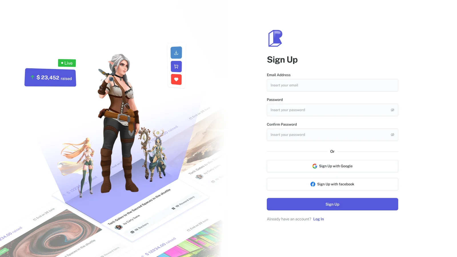
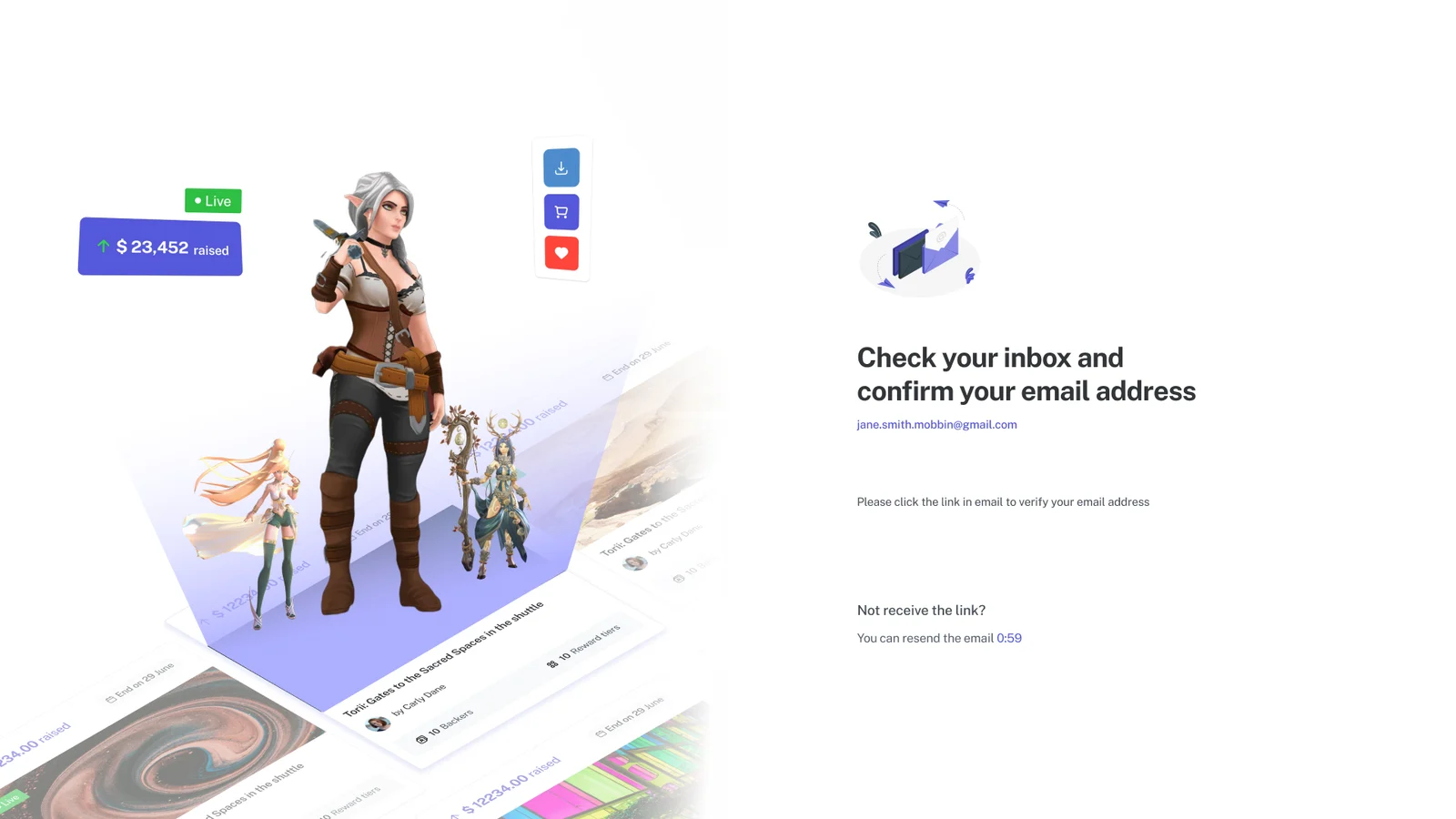
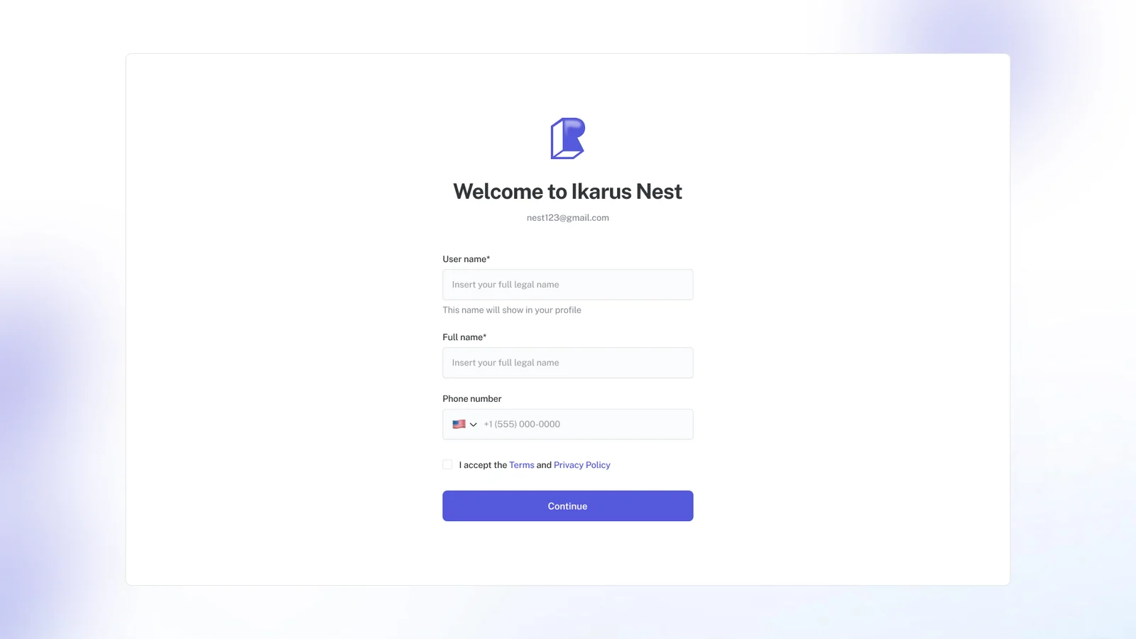
A short sign-up (account, email, username, terms). Becoming a seller is a separate step that comes later. And real, running campaigns on the sign-up screen itself, to show that people are already here.
Nobody has to prove who they are until they are about to sell something, and the very first screen already shows the shop at work.
Live campaigns sit beside the sign-up form
- Decision
- Give half the sign-up screen to running campaigns rather than to brand art.
- Because
- An artist's first question is whether anyone is here. A brand-new shop can't answer that by saying so. It has to show something happening.
- Result
- The marketplace starts selling itself before anyone has an account.
ID checks come later, not first
- Decision
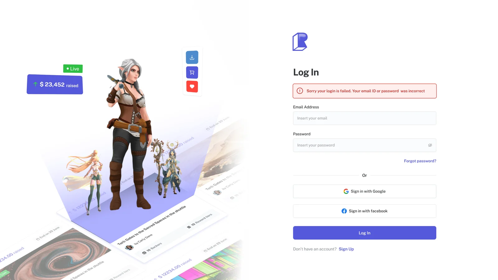
- Sign-up asks for an account, an email check, a username and the terms. Becoming a seller is its own step, later.
- Because
- The friction artists named was being asked to prove who they are before they had a reason to.
- Result
- You can be browsing two screens after you arrive. Proving who you are waits until you have something to sell.
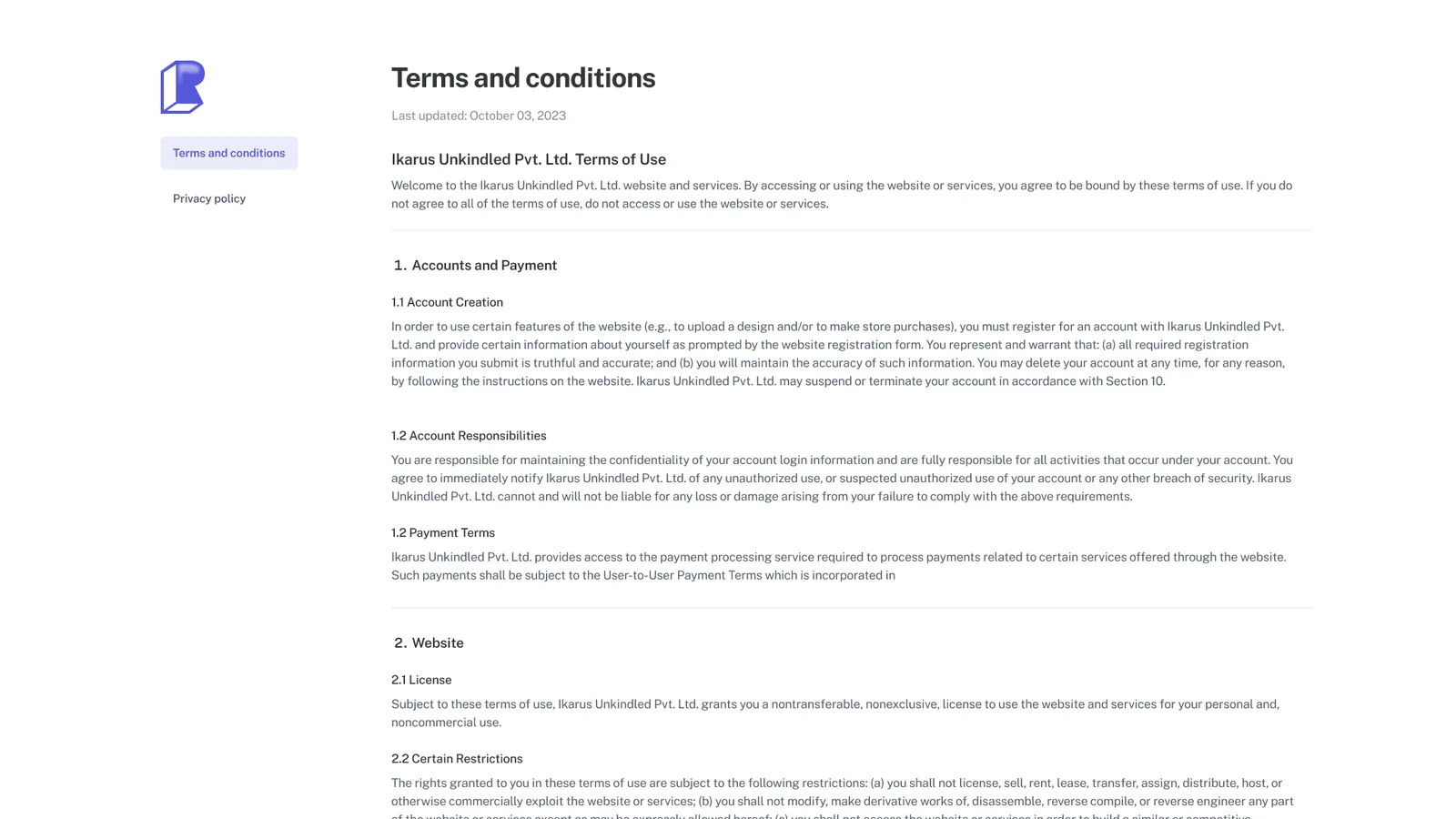
Explore
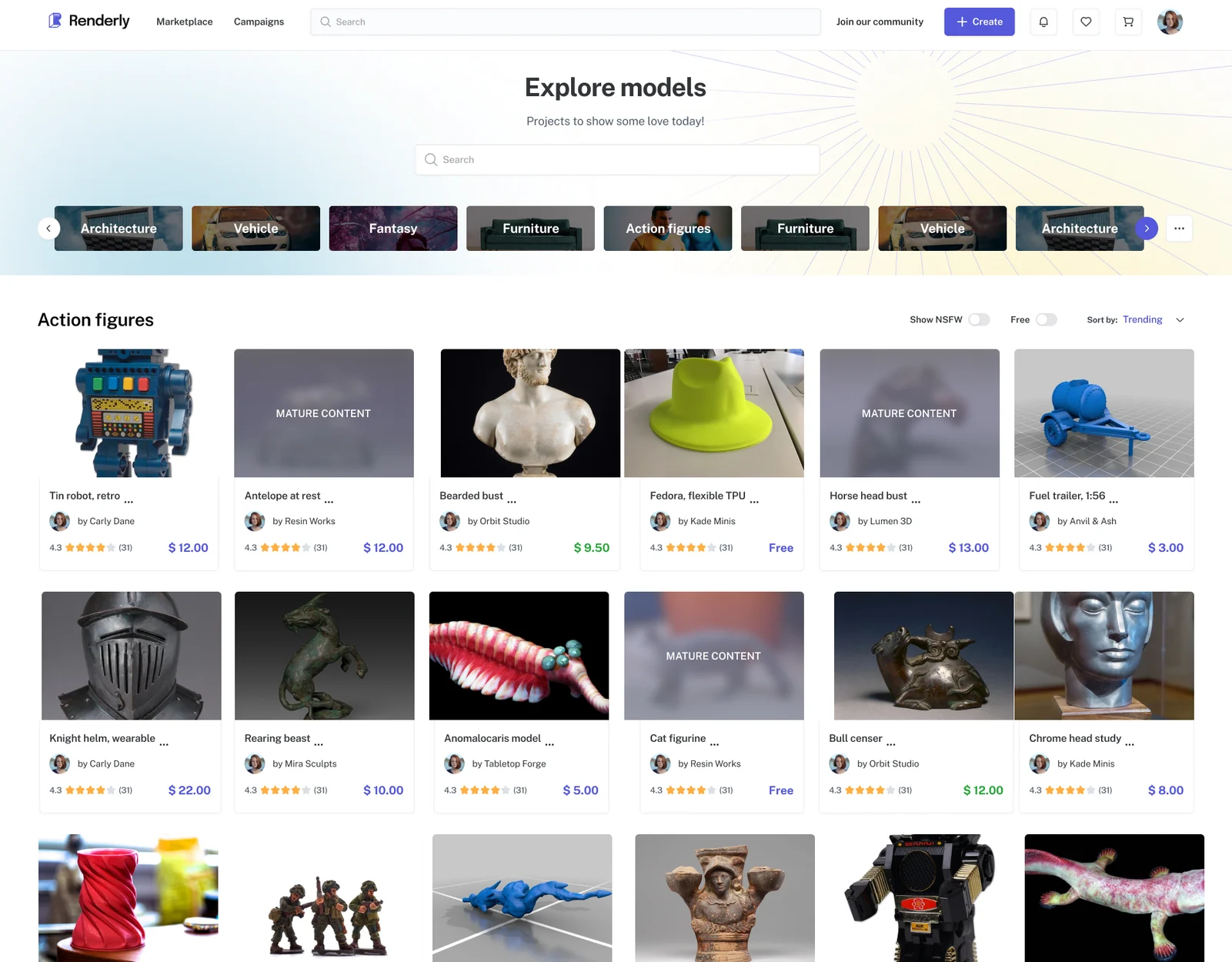
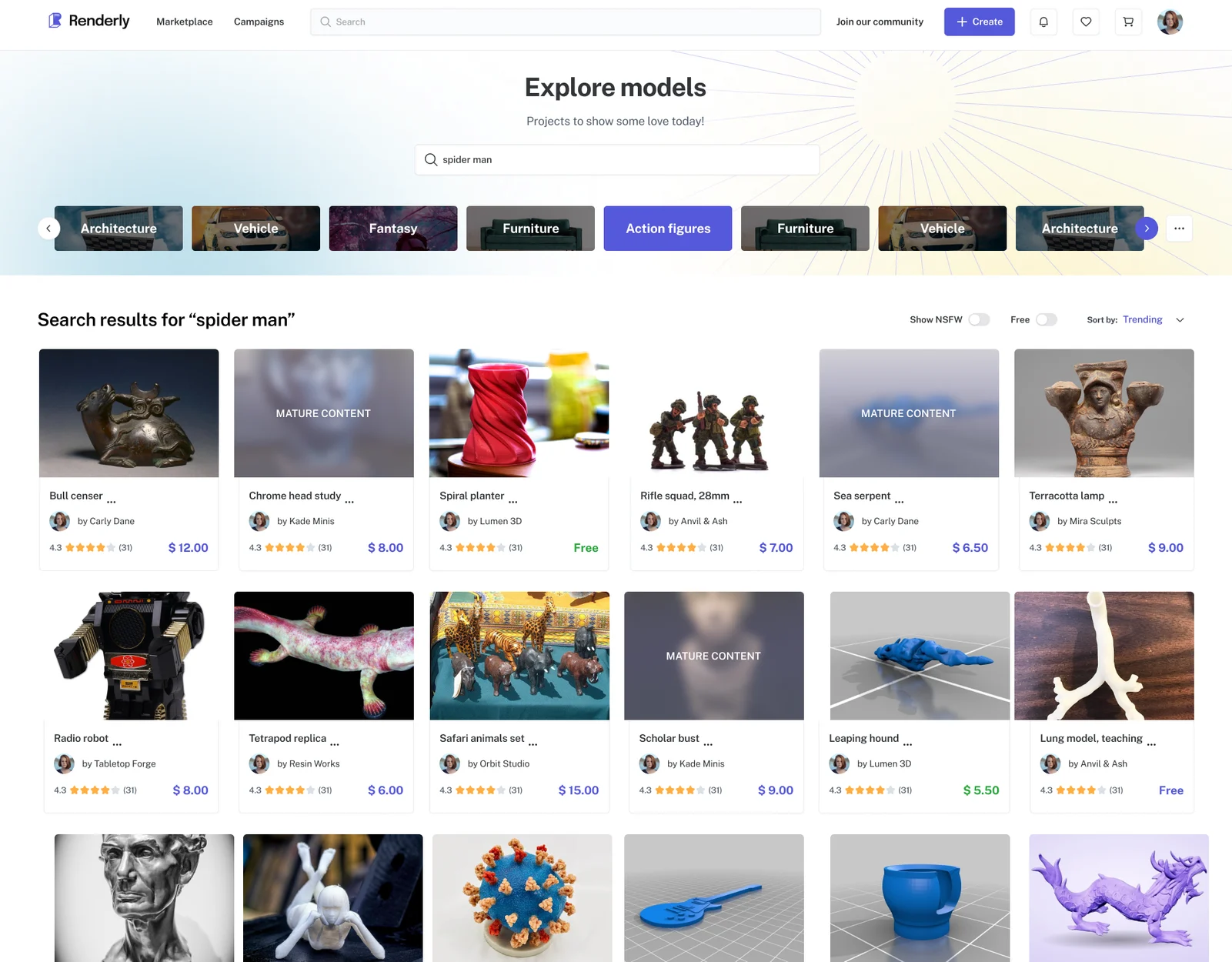
Buyers’ most common complaint was finding the right thing. Search on other sites was poor, and artists often renamed their models to avoid copyright complaints, so a model often wasn’t called what people would search for. Artists’ top request was the other side of the same problem: to be seen.
One screen answers both. Browsing for people who don’t know what they want; search and category filters for people who do.
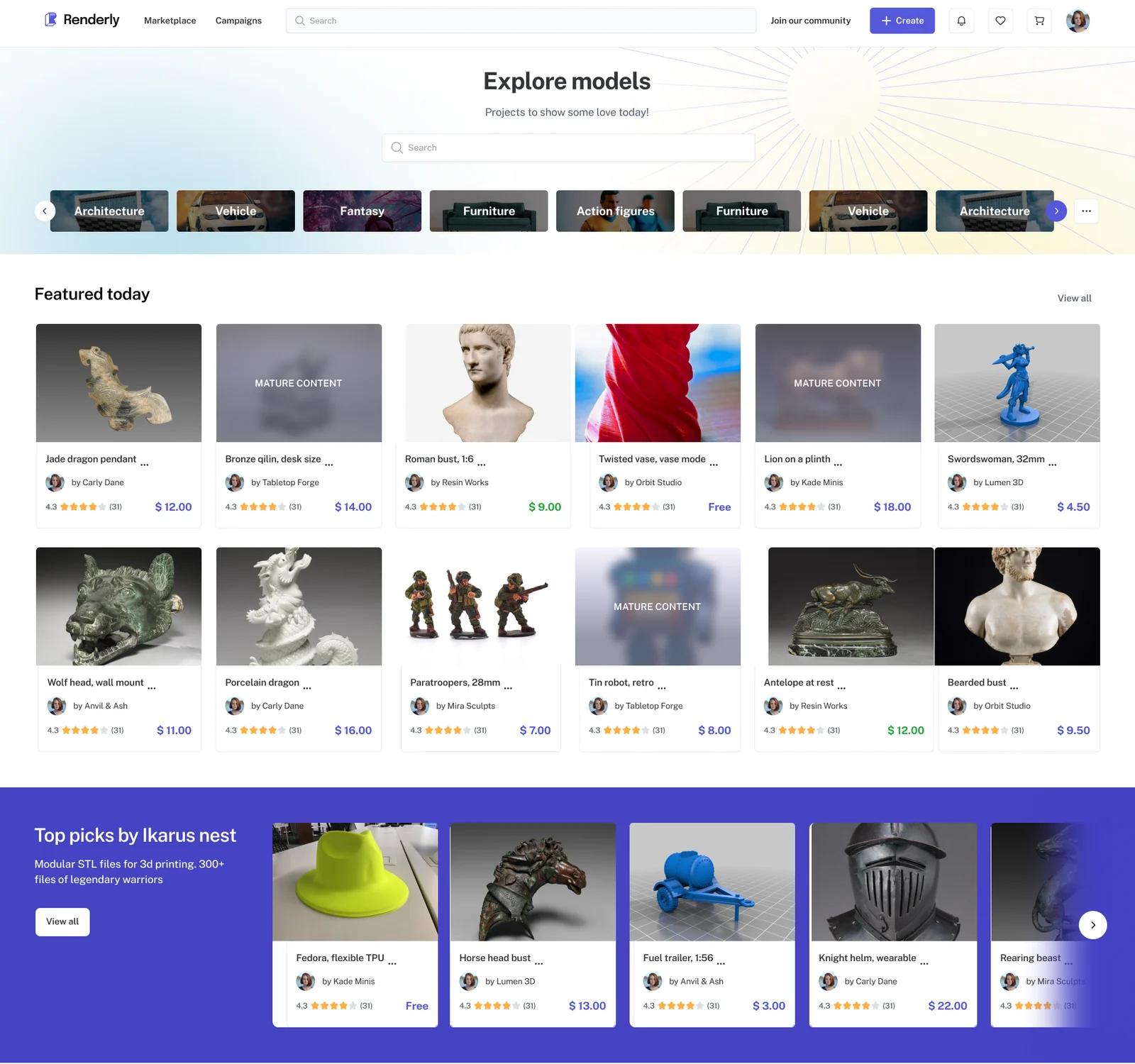
- Search firstAbove the categories, because the buyers who know what they want are the ones being failed elsewhere.
- Categories as a railNamed by what people print, not by file type.
- Hand-picked rowsFeatured, free, ready to print. A place in a row is the visibility artists asked for.
The model page
Buyers said they judge a file by its pictures, and by photos of it printed, before they spend anything. Underneath that is one question that almost every complaint came back to: will this print on my machine?
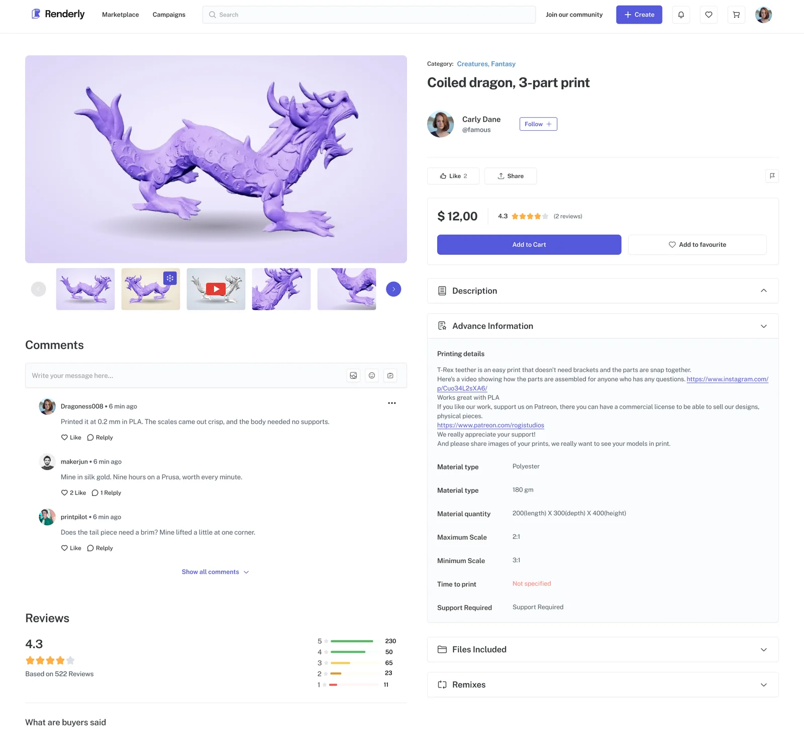
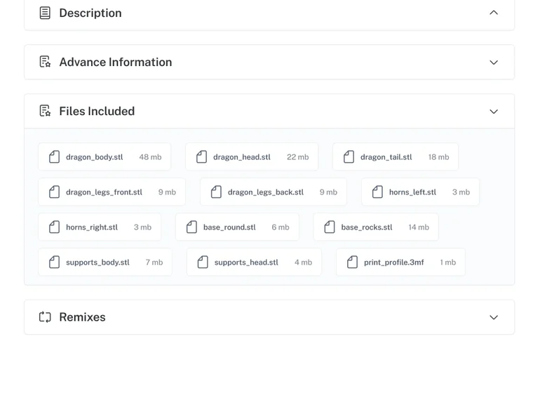
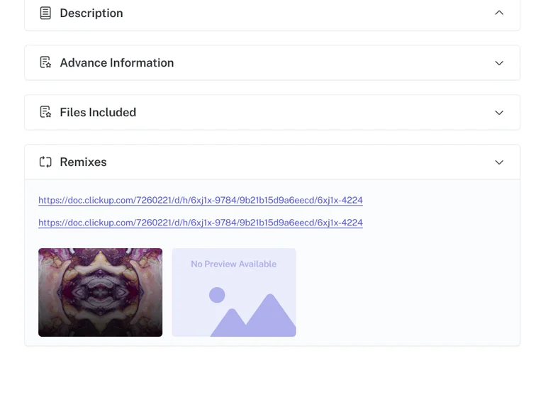
That answers the machine half. The other half is whether to trust the artist, and the obvious answer is a gallery of the artist’s own test prints. This page does something better.
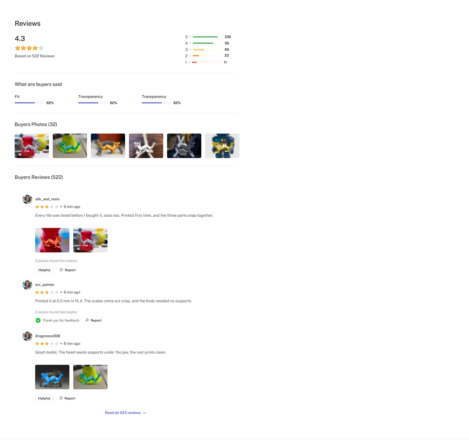
- Rating distributionThe shape of the score, not just the number.
- Ratings by topicScored on the things that decide a print, not just on whether people liked it.
- Buyers' photosTest prints from people who already paid, pooled into one strip.
Proof comes from buyers, not the seller
- Decision
- Pool photos from buyers' own reviews into a strip on the model page, above the creator's gallery.
- Because
- An artist can choose which photos to show. Buyers' photos can't be chosen that way. Both show the same print, but only the buyers' photos are proof.
- Result
- The "will it print" question gets answered by people with the same problem, which is the only answer buyers said they trusted.
Comments sit above the reviews, with replies and a way to report them. The questions people ask before they buy and the verdicts they leave afterwards are different things, so they get separate lists.
Campaign creation
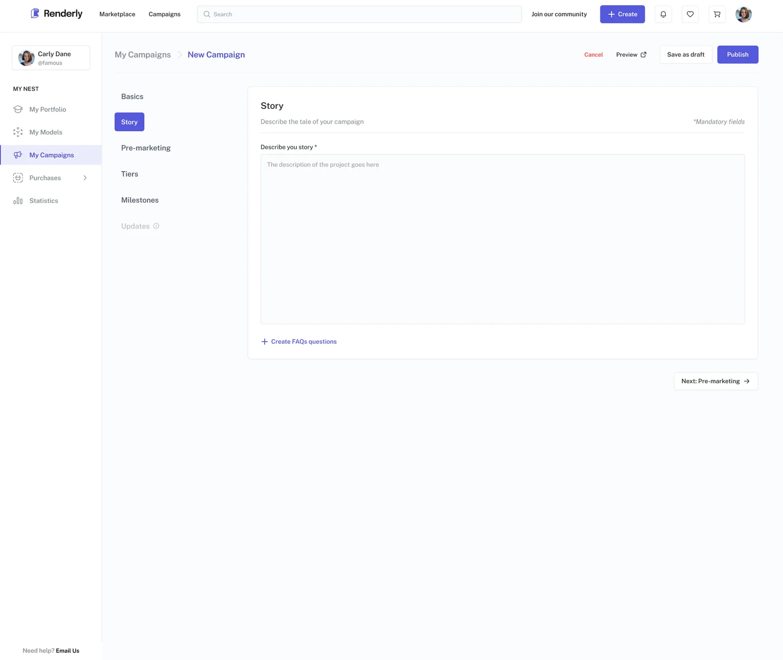
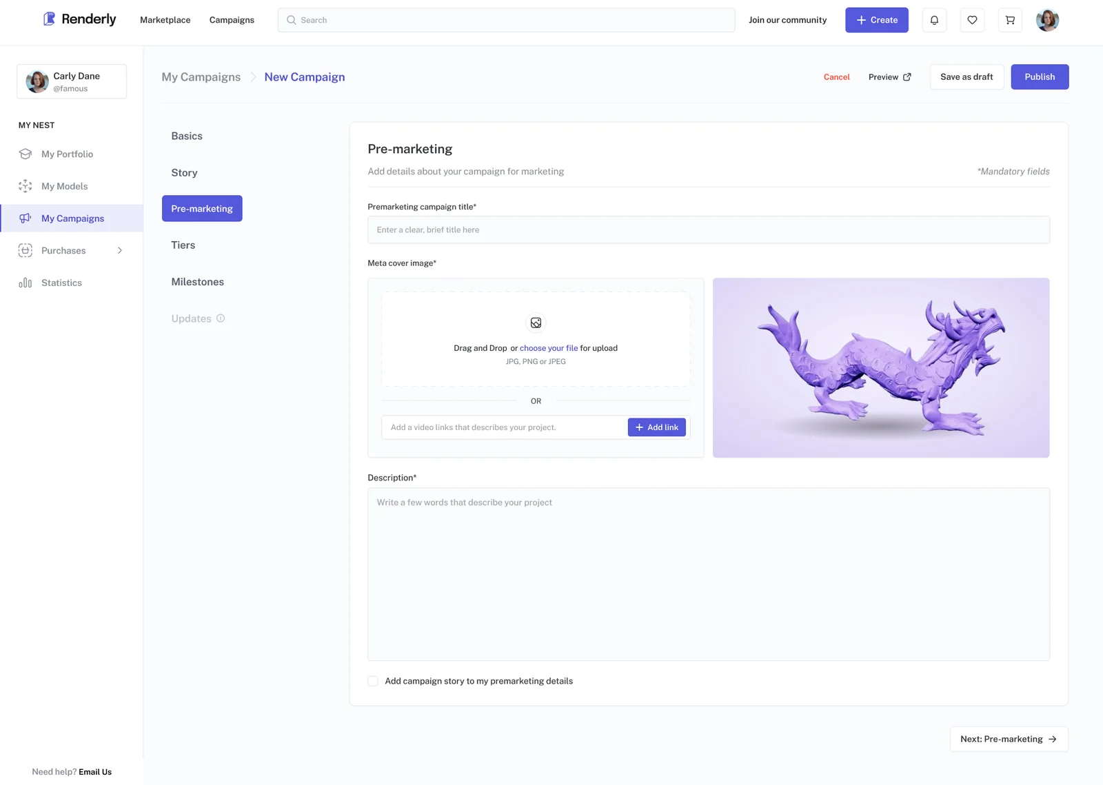
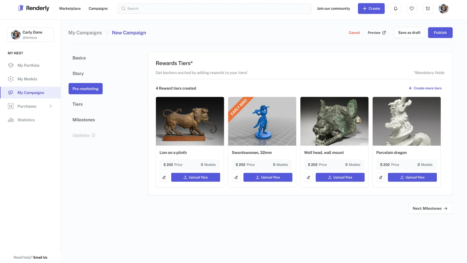
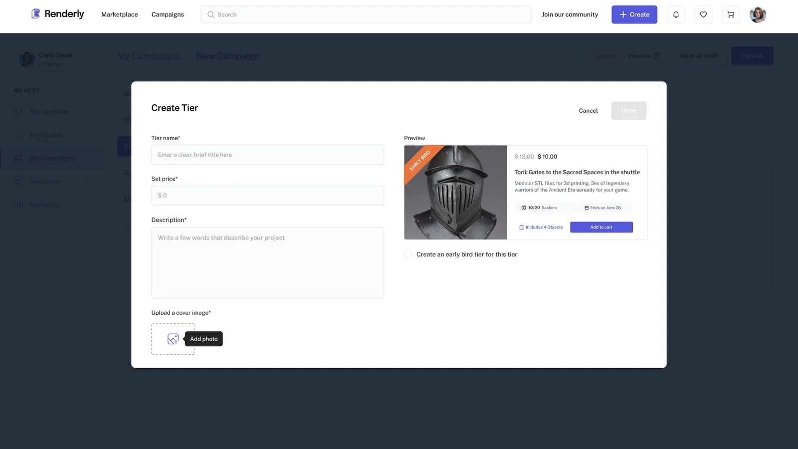
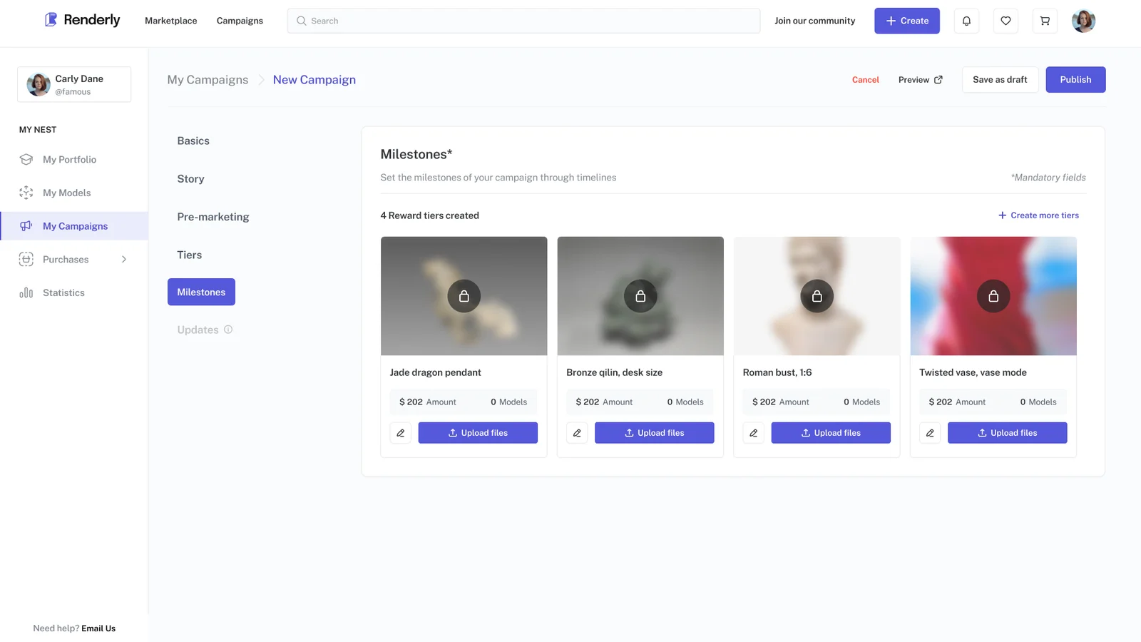
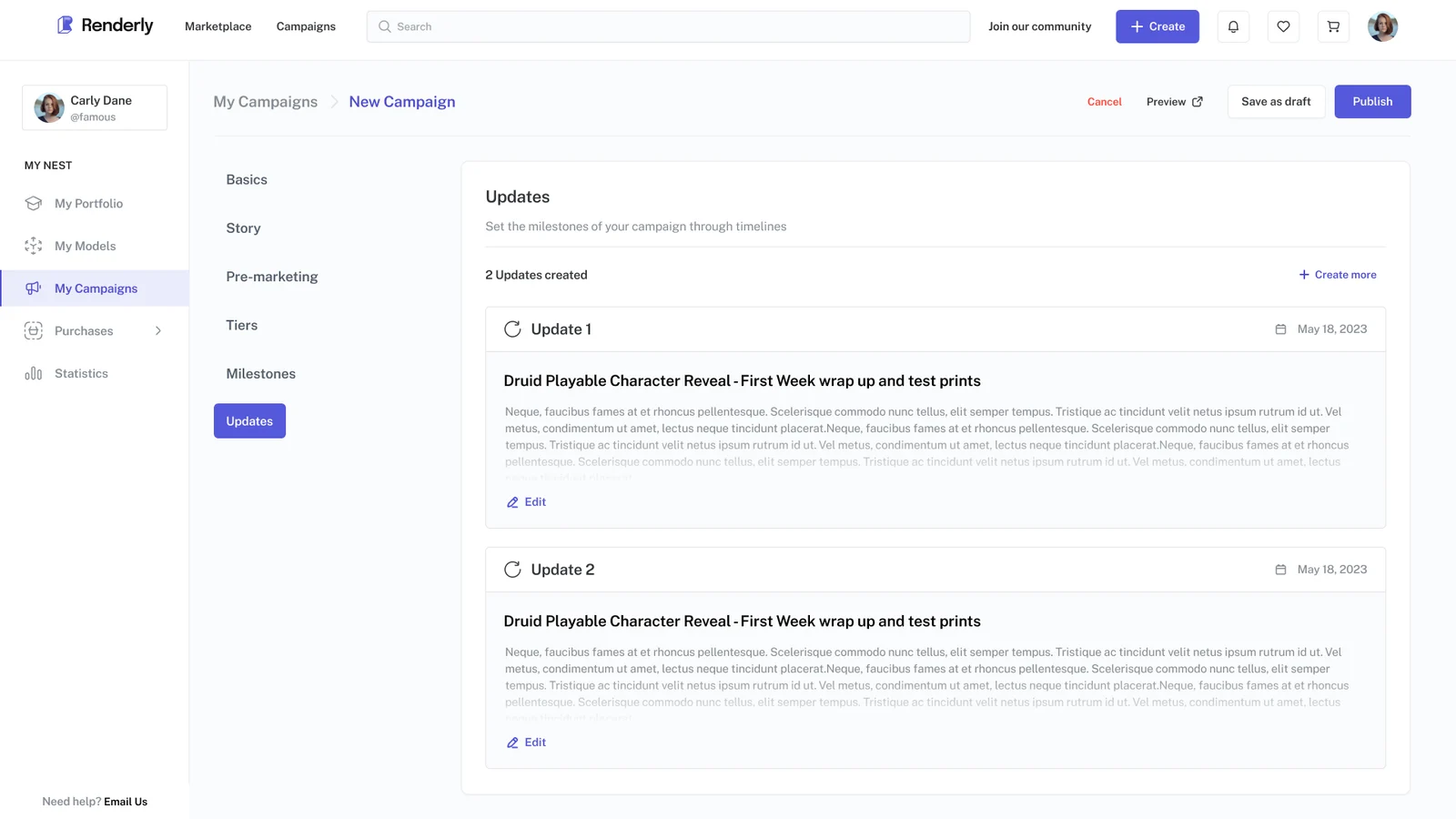
A campaign is how an artist raises money for new work: fans pay upfront and get rewards when it is made. Building one takes six steps: Basics, Story, Pre-marketing, Reward tiers, Milestones and Updates. Three of those steps exist because artists told us what was missing elsewhere.
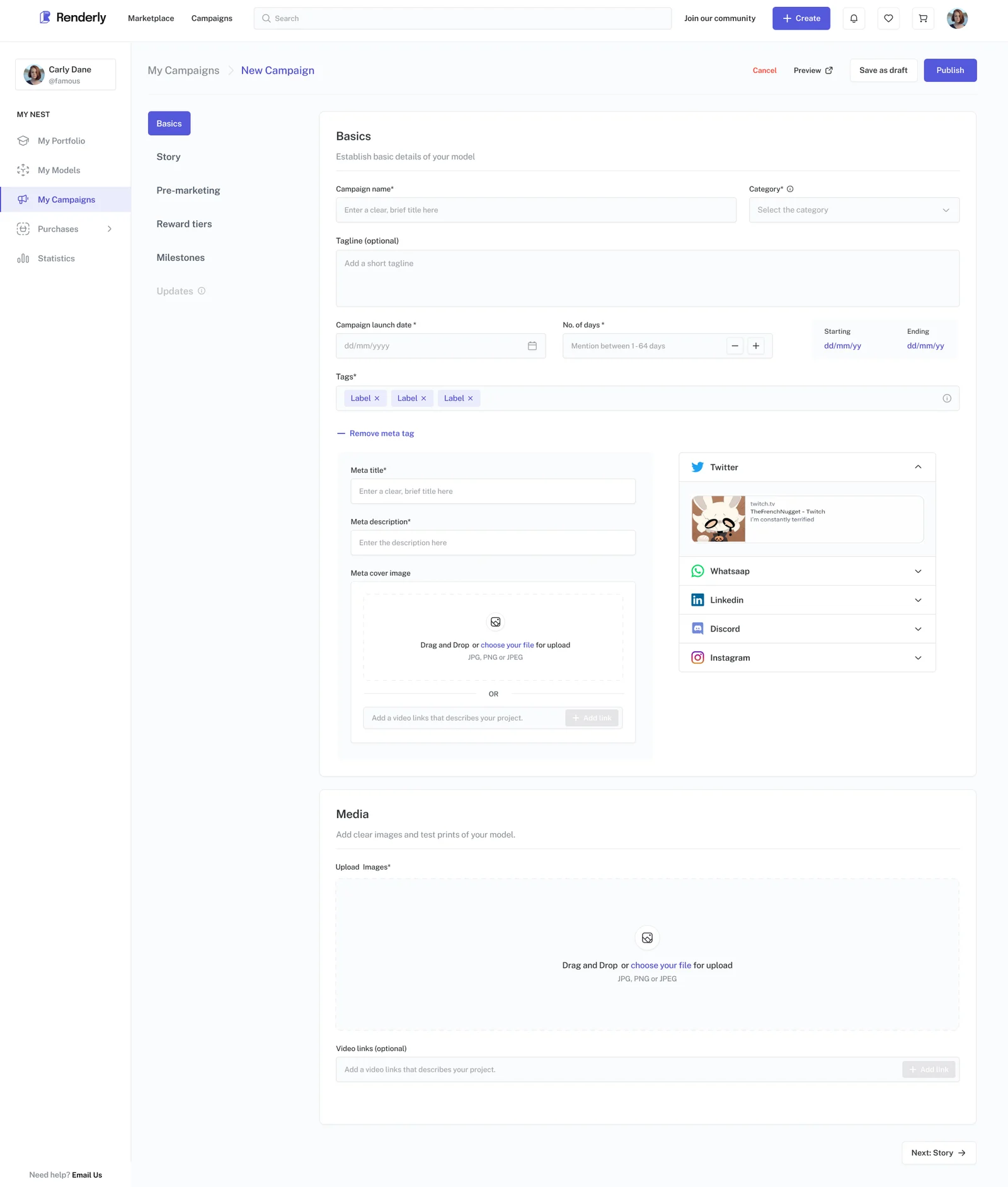
- The step railSix named steps, with Updates greyed out until the campaign exists.
- Persistent actionsCancel, Preview, Save as draft and Publish stay in the header on every step.
- Launch date plus durationBetween 1 and 64 days, with the start and end dates worked out for you beside it.
- Tags, checked as you typeAt least three, at most five. While Publish is greyed out, a tip explains why.
Updates
One artist's loudest complaint was that MyMiniFactory only had plain comments, where Kickstarter has a blog-style Updates feed. So he couldn't show progress on a new stretch goal (a bonus reward that unlocks if a campaign raises more than its target).
Pre-marketing
Another said the first problem on both sites he used was that he couldn't track his Facebook and Instagram ads (Meta Pixel). Pre-marketing has the meta tag fields, which set what a shared link shows, for exactly that reason.
Milestones
The same artist again: there was no proper way to set stretch goals. Milestones is that, and each milestone unlocks the reward tiers tied to it.
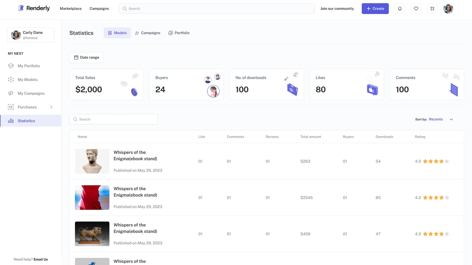
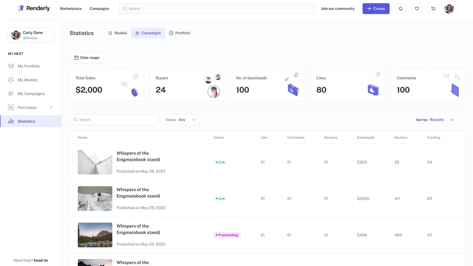
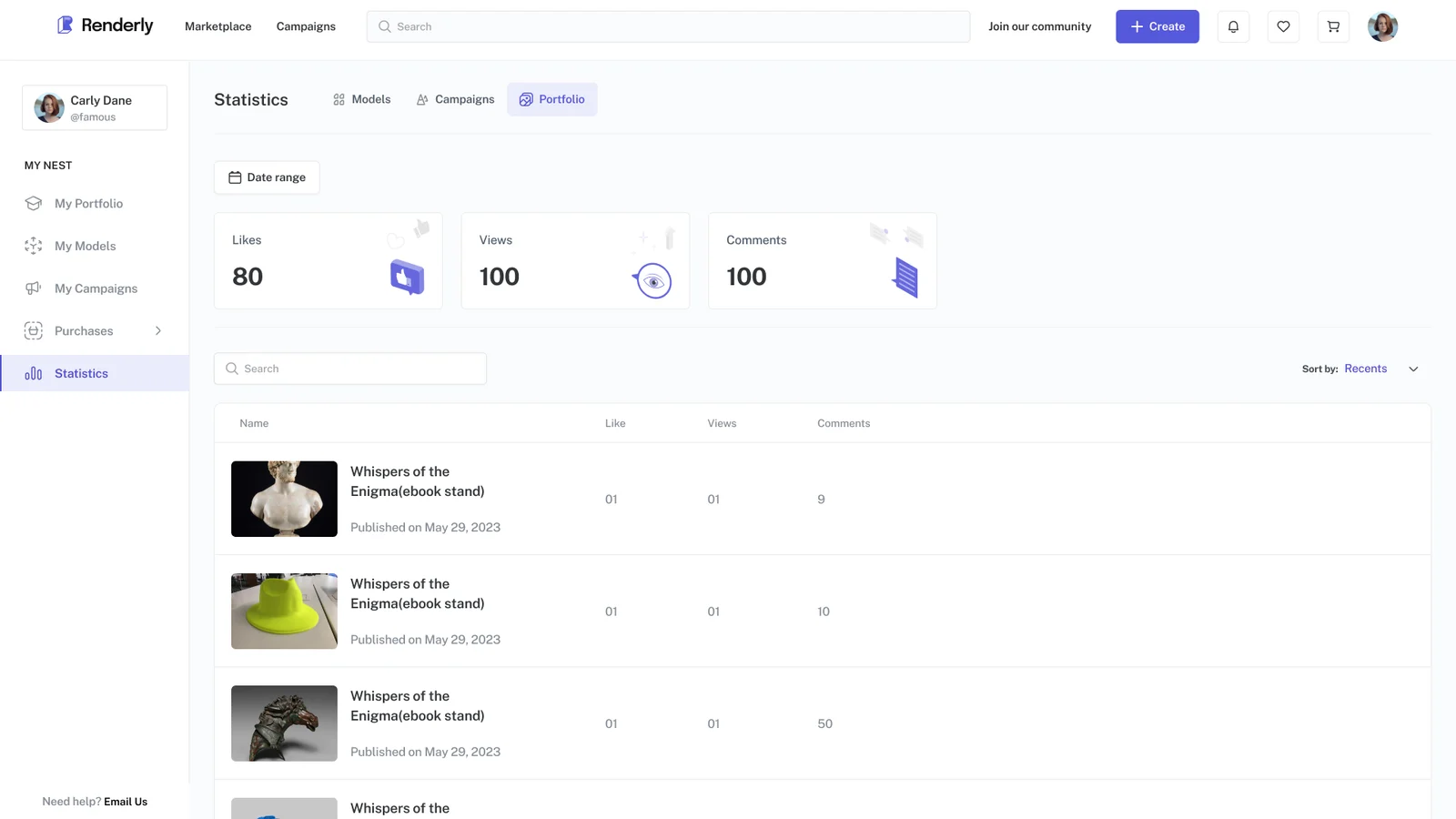
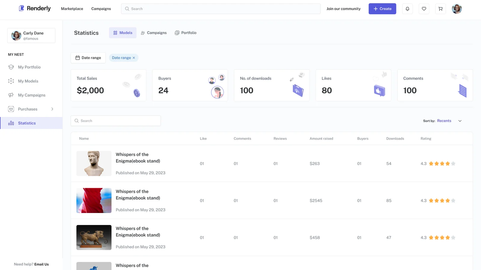
Statistics
Seeing their numbers was in the artists’ top five requests, and they complained about it on every site. One artist could see the total a shared sales link had earned, but not which rewards it had sold.
Edge cases
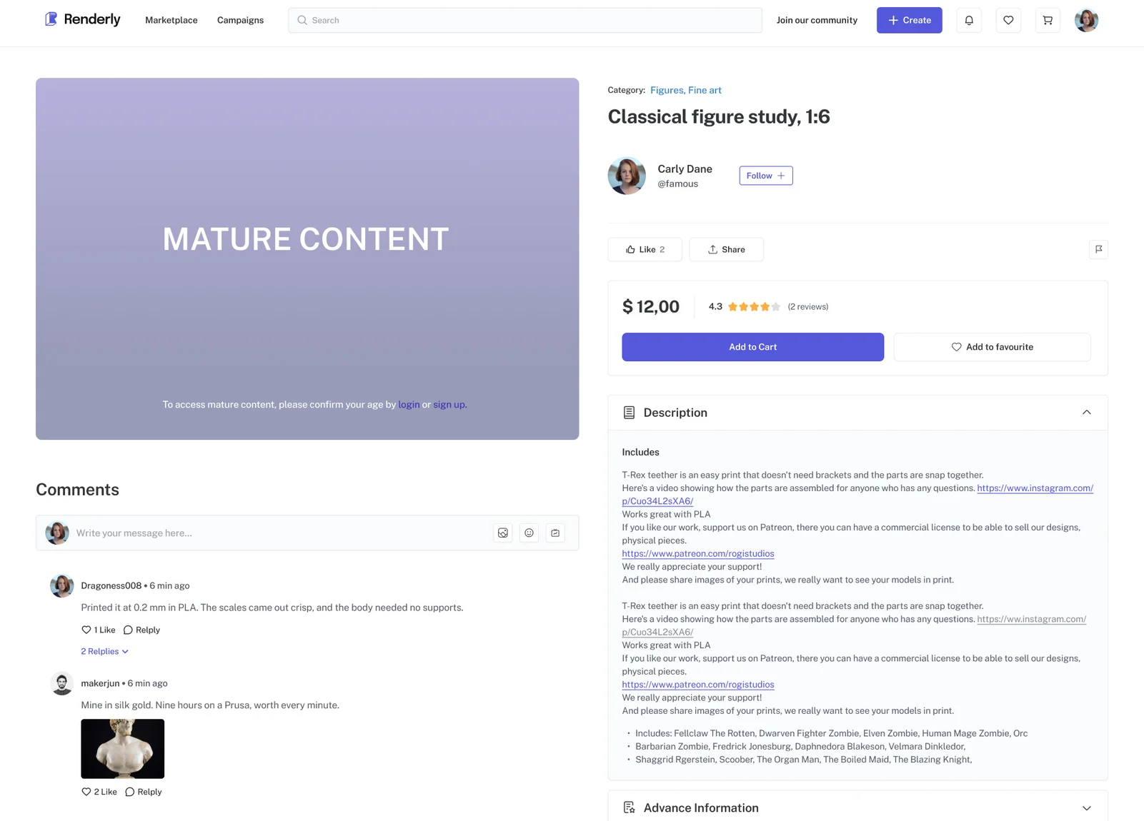
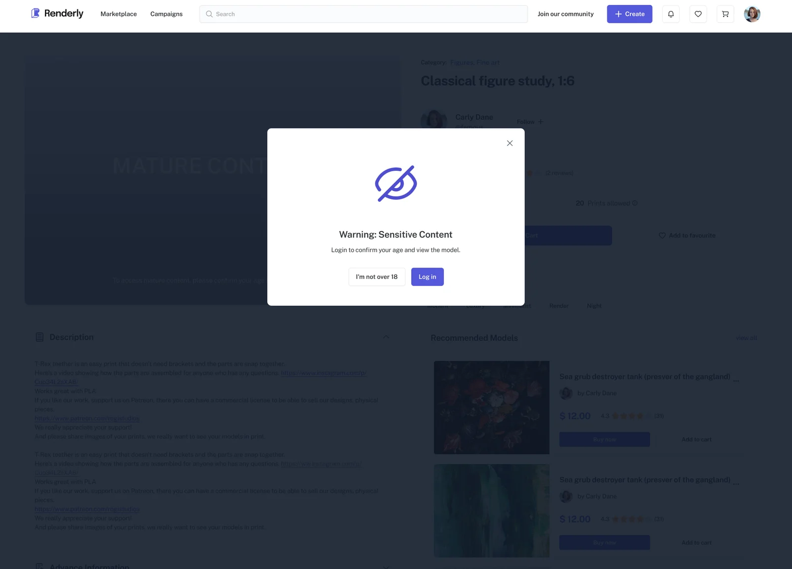
Mature content
One artist told us that if pin-ups and tasteful nude figures weren’t permitted he wouldn’t use the platform, because that was most of what he made. That’s a policy question that arrives as a design problem.
The answer was a gate, not a ban. Adult models stay listed and searchable. Only their images are hidden, behind a warning and a prompt to log in, for anyone who isn’t signed in.
Deleting a model
Deleting a model means three different things, depending on who it affects, and each one gets its own screen.
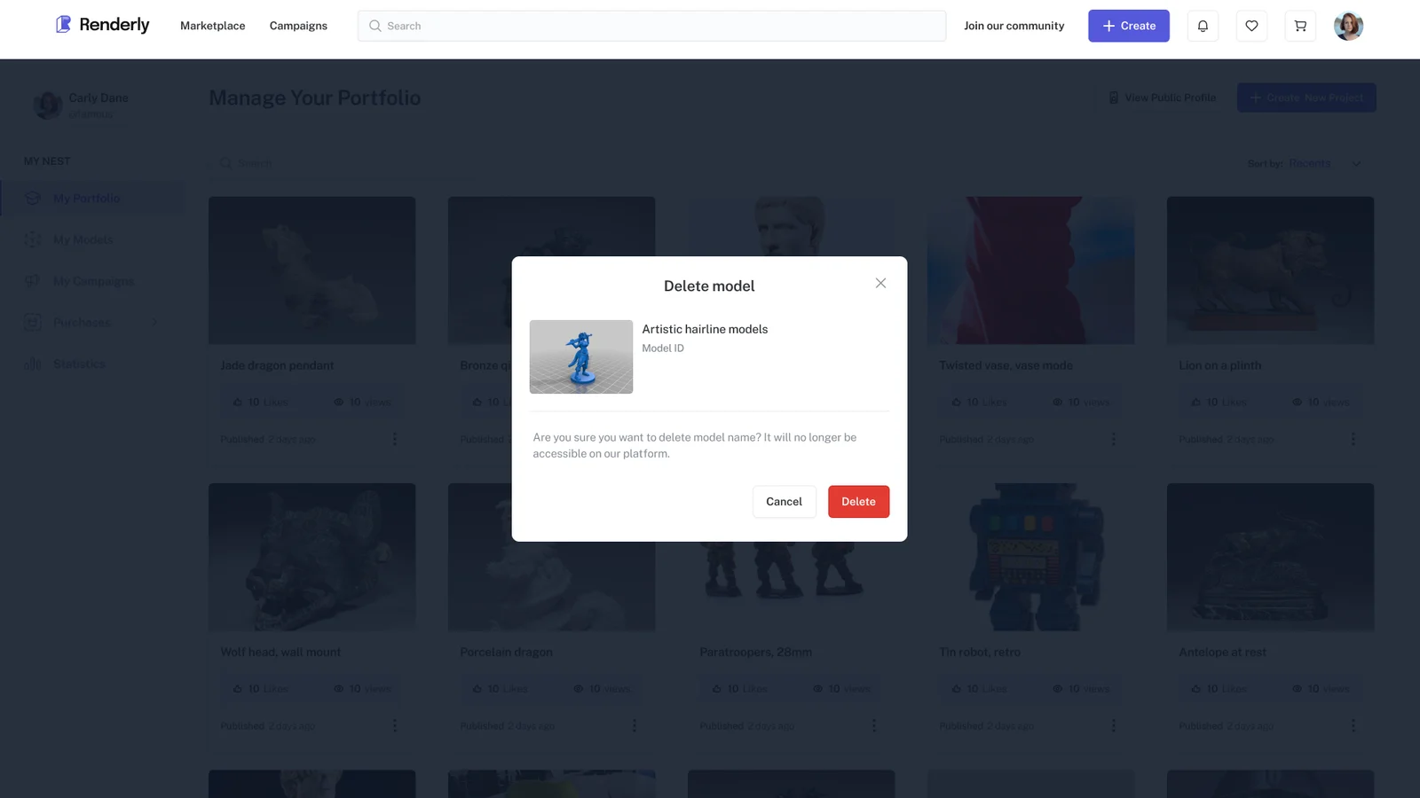
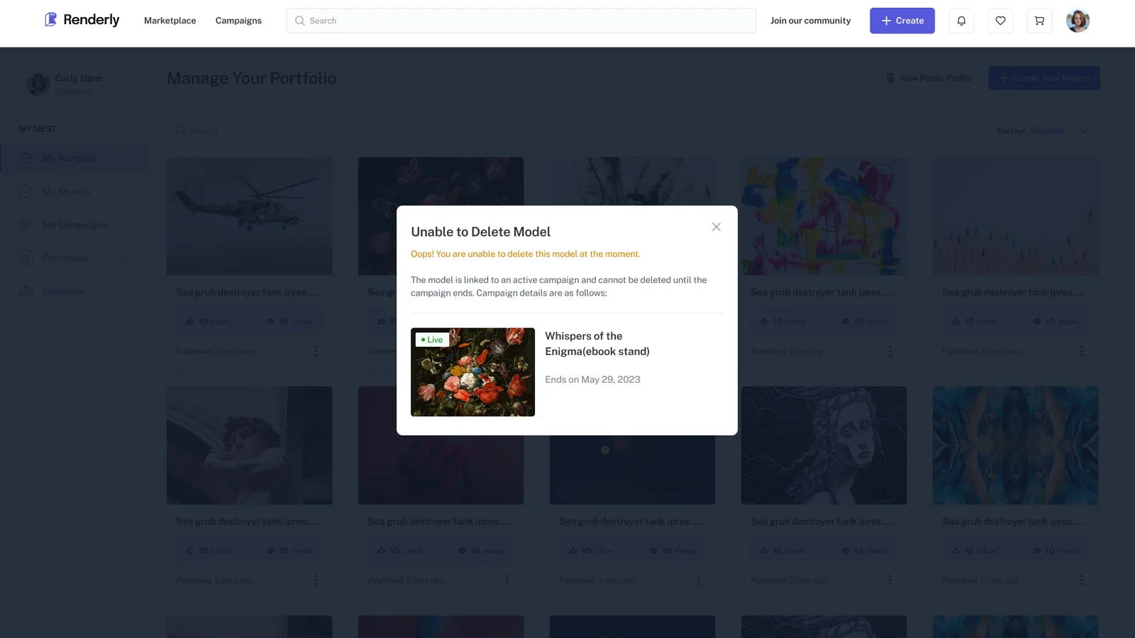
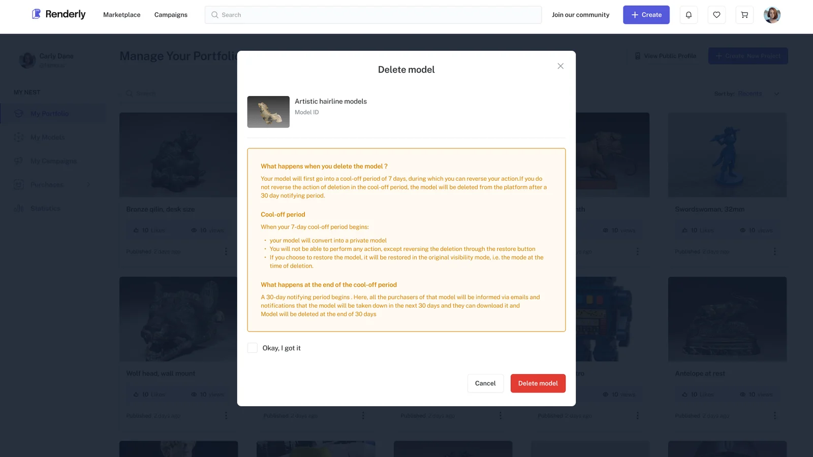
A shop sells people access to something.
So deleting it is about what buyers are still owed, not about a button.
Empty states
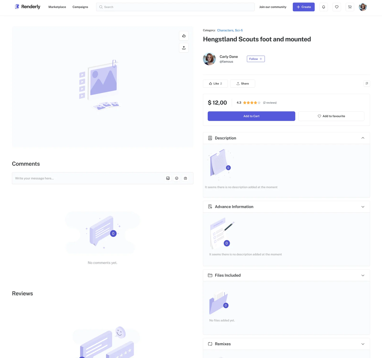
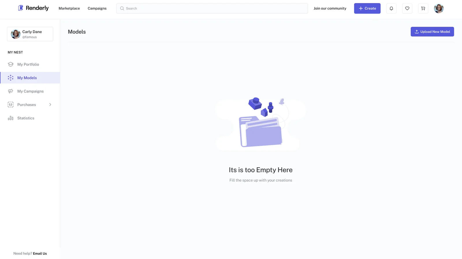
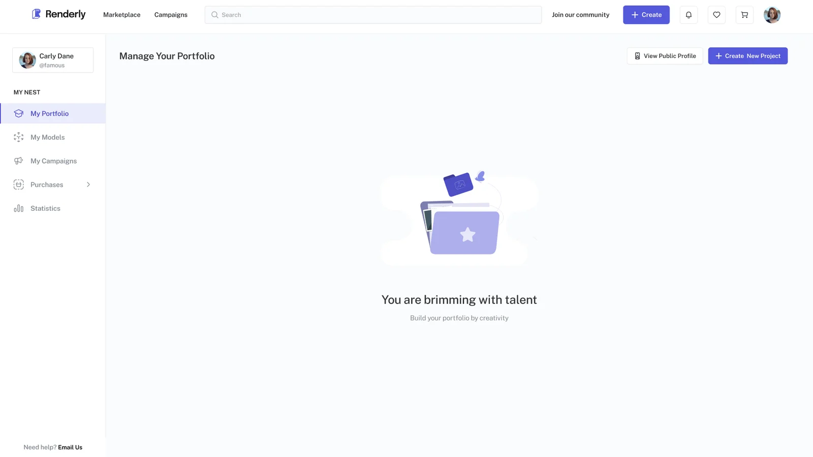
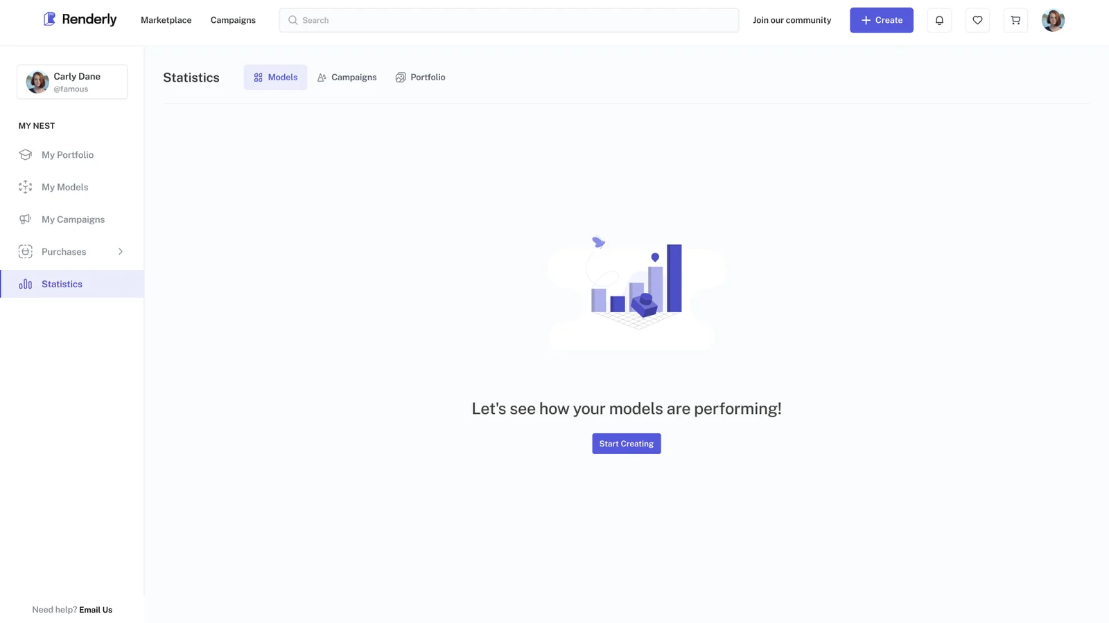
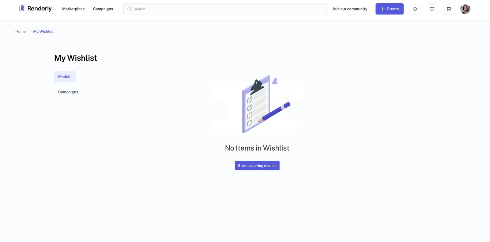
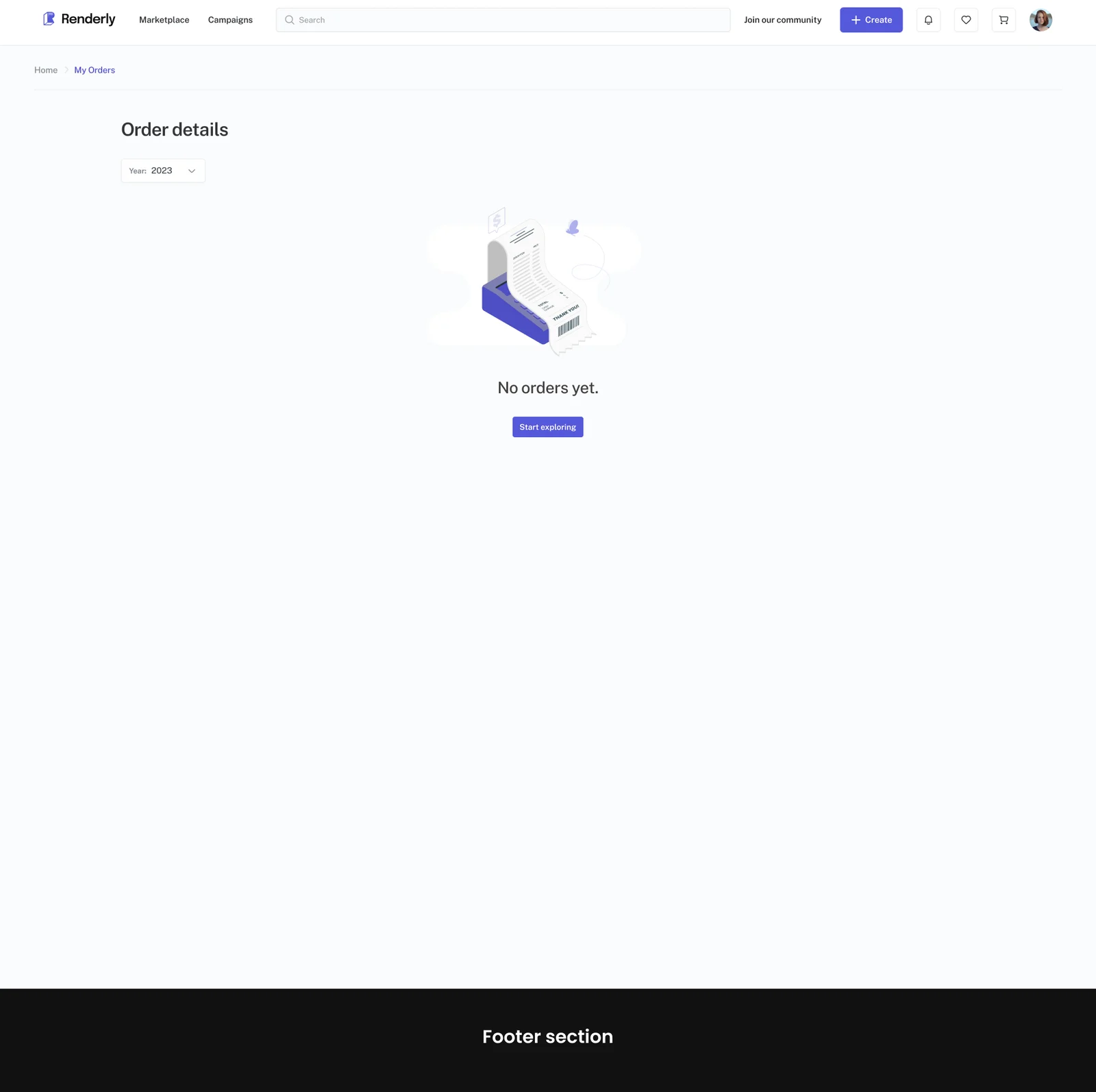
An empty state is what a screen shows before there is anything in it. Every one of these was mine: model detail, statistics, wishlist, orders, first portfolio upload, first model upload.
A new shop has nothing in it on day one, and every new user starts with nothing too, so the empty screen is the real first impression. Each one names what goes here and what to do next, rather than reporting that nothing exists.
Design system and handoff
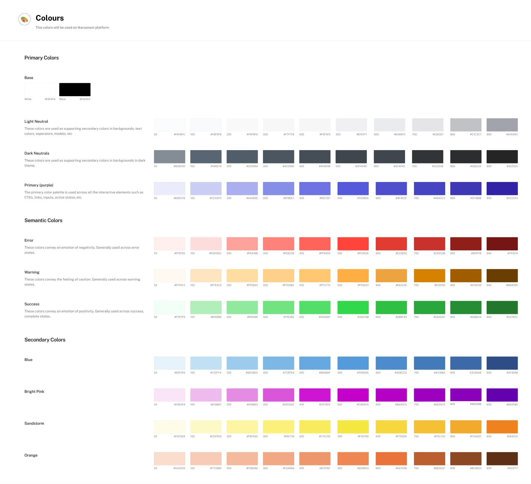
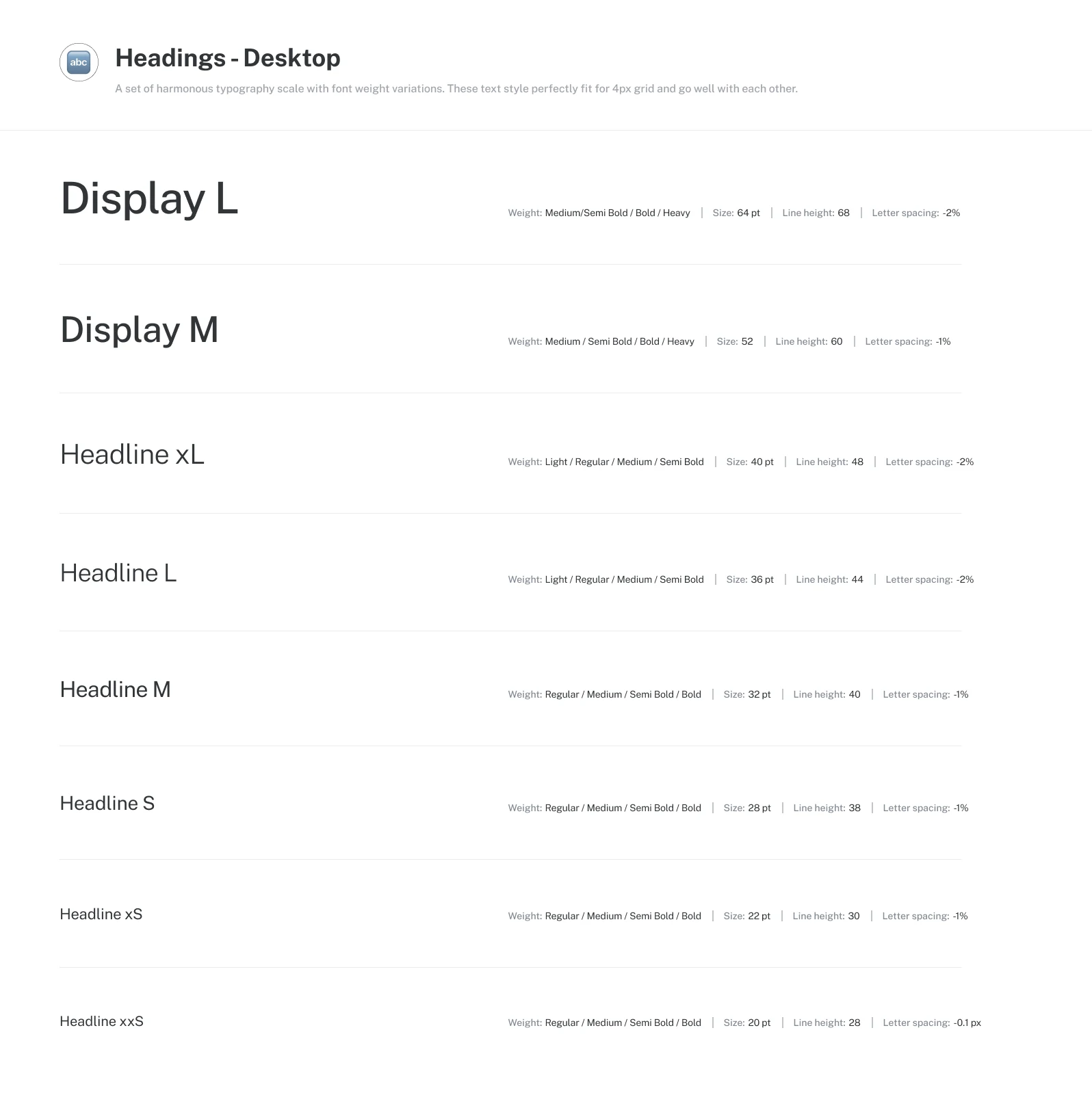
This was before Figma had Dev Mode, so how things behave had to be written down. The notes in the file say what happens and when, not just what things are called.
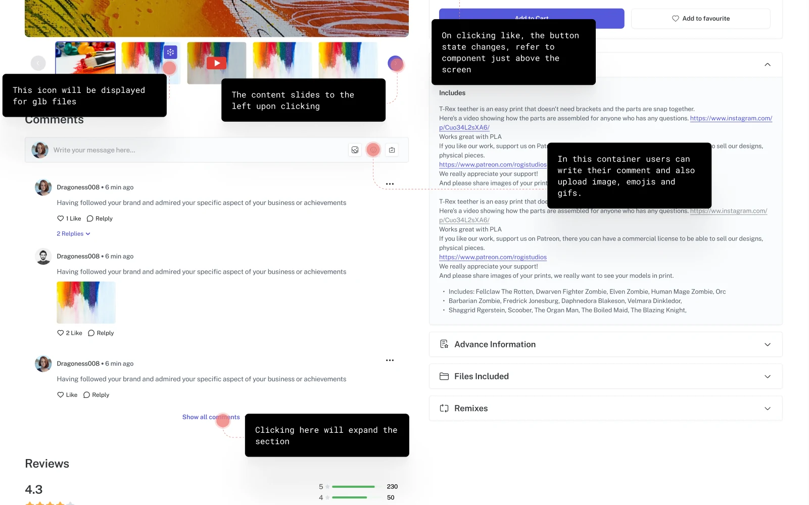
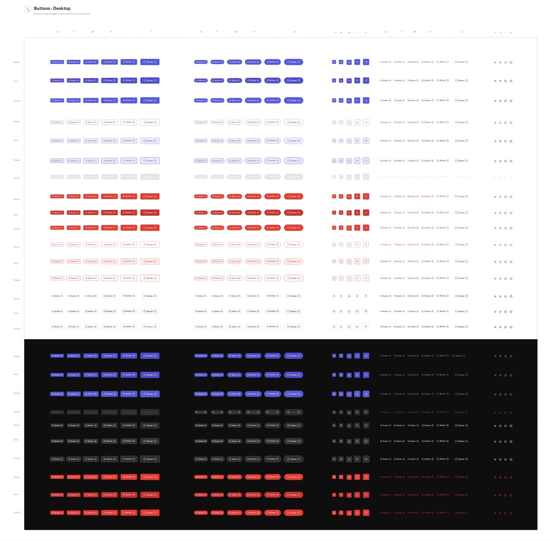
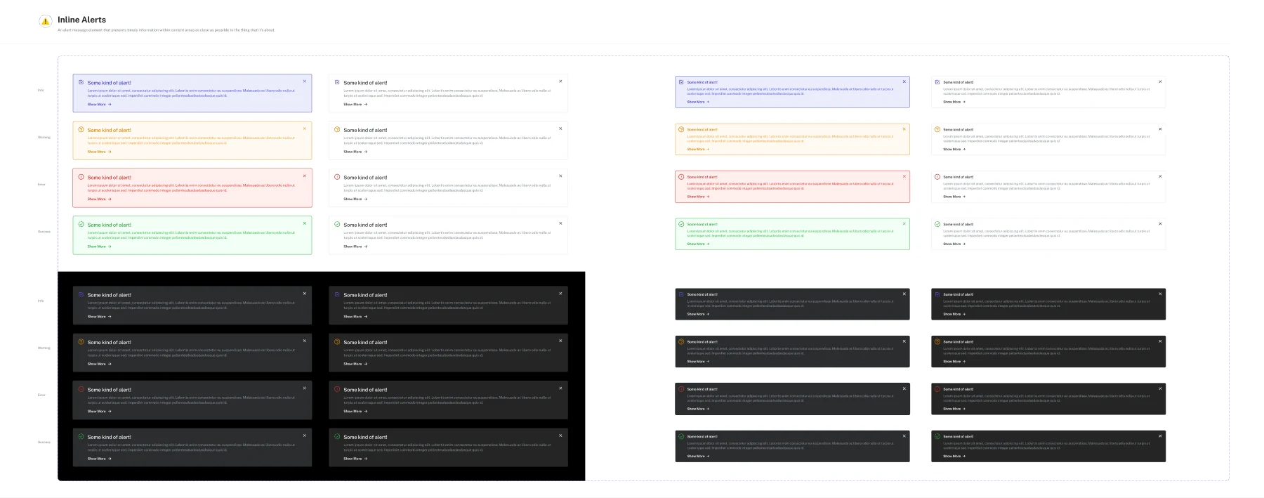
- Tooltip on the inactive Publish buttonAppears on hover, explaining what is still missing.
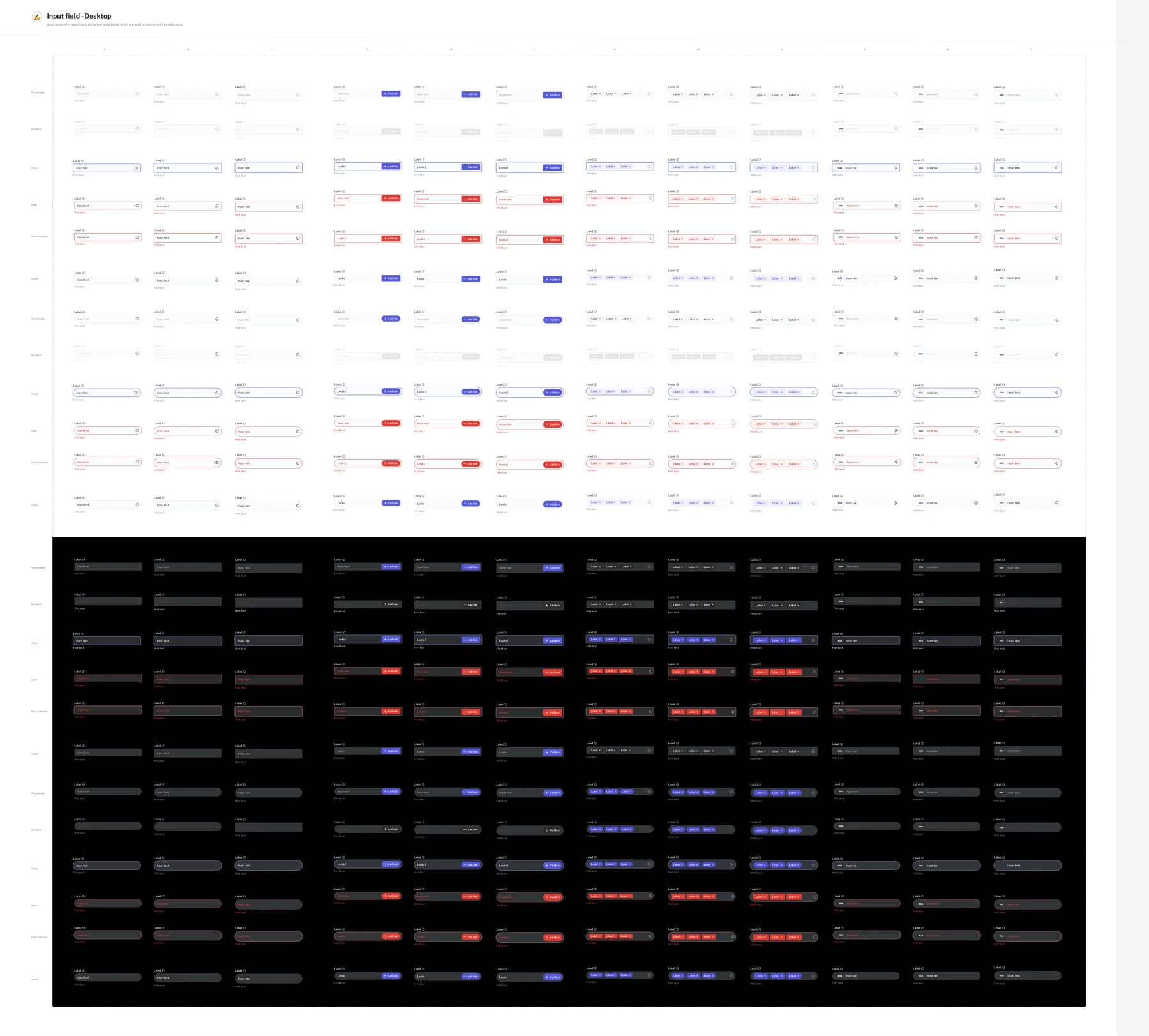
- Minimum three tags, maximum fiveEnforced in the field, not on submit.
- The continue button activates only after the checkbox is tickedStated on the screen, so nobody ships it the other way round.
- This icon appears only on GLB filesA condition, not a decoration.
- Clicking here expands the section; content slides left on clickDirection and trigger, both written down.
- Asterisked labels mark mandatory fieldsOne rule, applied across every form in the file.
Without Dev Mode, anything not written down gets decided by whoever builds it.
Which is fine for spacing, and a disaster for rules like “only show this when…”.
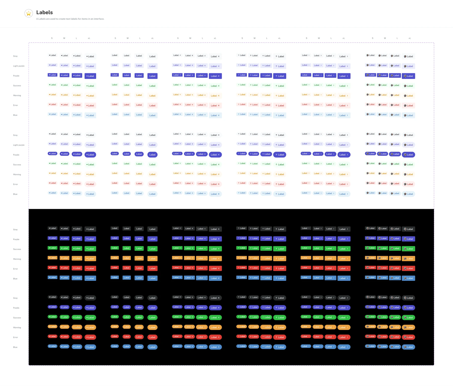
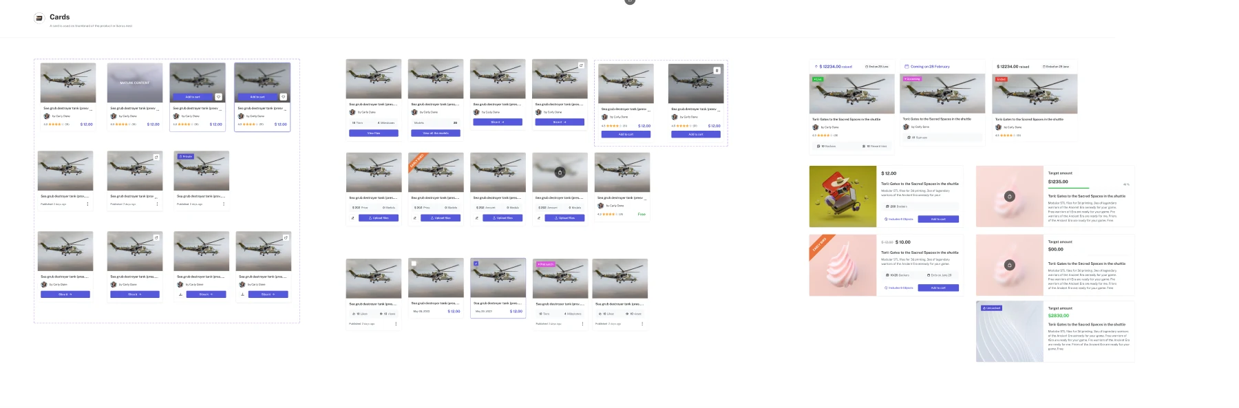
The components underneath the screens were built as one set, in light and dark, with every state (hover, error, disabled) drawn rather than described.
What I learned
A marketplace, a campaign builder, statistics and a component system where every screen can be traced back to something a real artist or buyer told us. Handed off with the behaviour written down, not left to be guessed.
The research came late. It showed the big idea was wrong after the product had already been planned around it. Talking to 43 people is cheap compared to building the wrong thing. Same team, same communities, same effort, just in the wrong order.
Design for a sparse marketplace, not just an empty one. Most of my screens assume listings, reviews, buyer photos and campaign history exist. The empty states cover the blank case. Twelve models and four reviews is the state that lasts longest, and I didn't design for it.
Piracy protection was deferred, not abandoned. Working out what the softened version looks like, protection as a choice rather than a constraint, was left open when the design work ended. It is the question I would pick up first.
In short
This project produced the marketplace and creator side of Renderly: onboarding, Explore, model pages built on buyer-supplied proof, a six-step campaign builder, statistics, the awkward edge cases, and the component system underneath, all handed off with their behaviour specified. It set out to answer what a shop with two kinds of user, artists and buyers, owes each of them on day one, after the research showed the original answer was the wrong one. My part was the design; the finding that made the design necessary was the team's.
Next case study
TBS
Today's plan, one tap away
A coaching app built around the one question a client asks every morning: what am I doing today? Five tabs, today's meals and workout up front, and a direct line to their coach.
Read it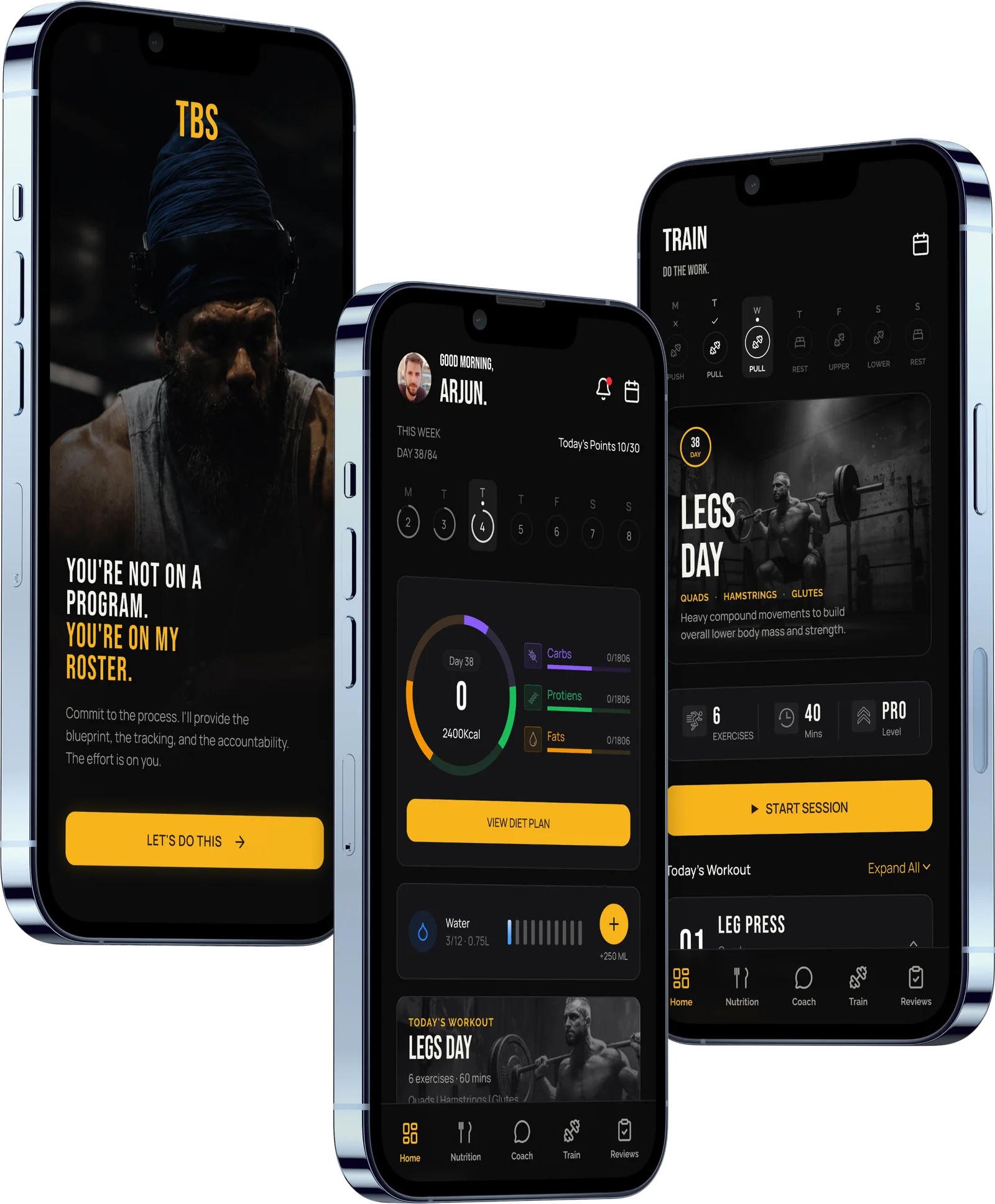
More work
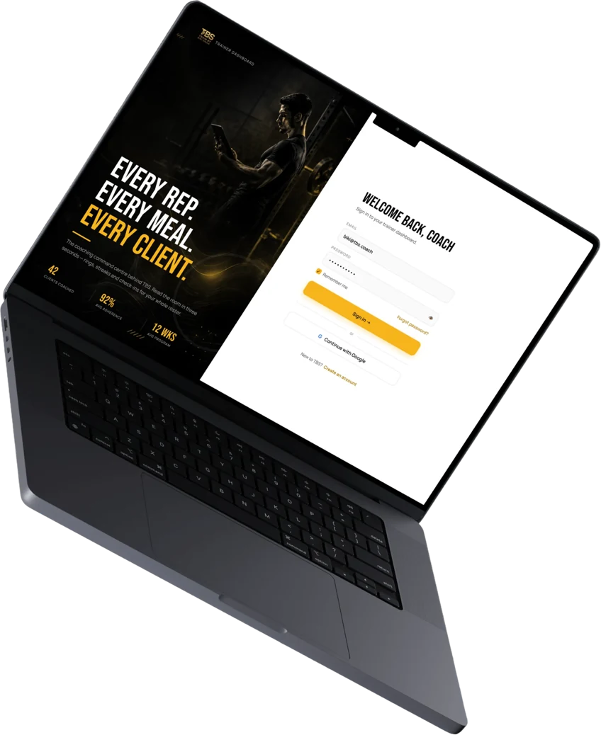 TBSReplacing a fitness coach's scattered workflow with one clear workspaceThe coach's side of the same product. A workspace that opens on one ordered list, who needs attention today and what each of them needs, with a plan builder to answer it.Read the case study
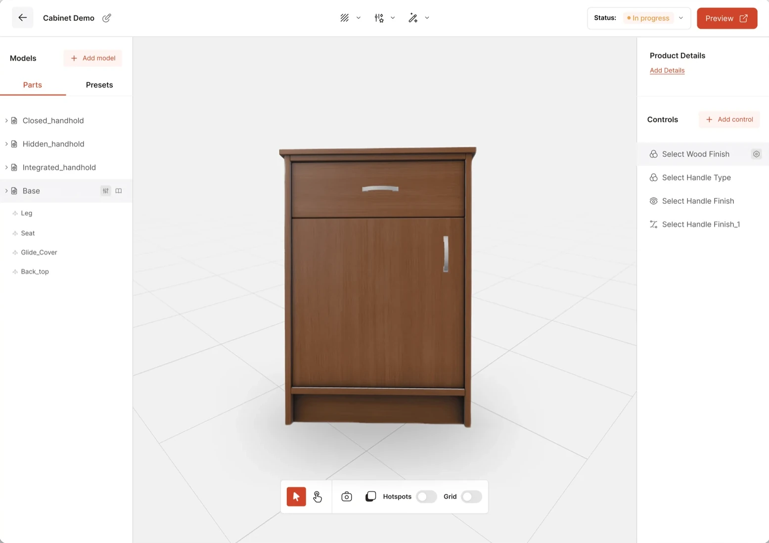 Ikarus DeltaCutting 3D configurator build time by 70% with one shared platformEvery 3D product configurator was hand-built from scratch and took ten to fifteen rounds of back-and-forth to finish. We replaced that with one platform, and a three-week build became a seven-day one.Read the case study
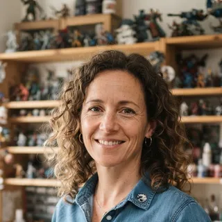
 The artist
 The person who prints
 an artist whose work went round on Telegram
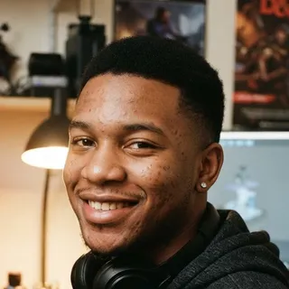 a printer owner, on being locked into ours
 prints at home